Target Location
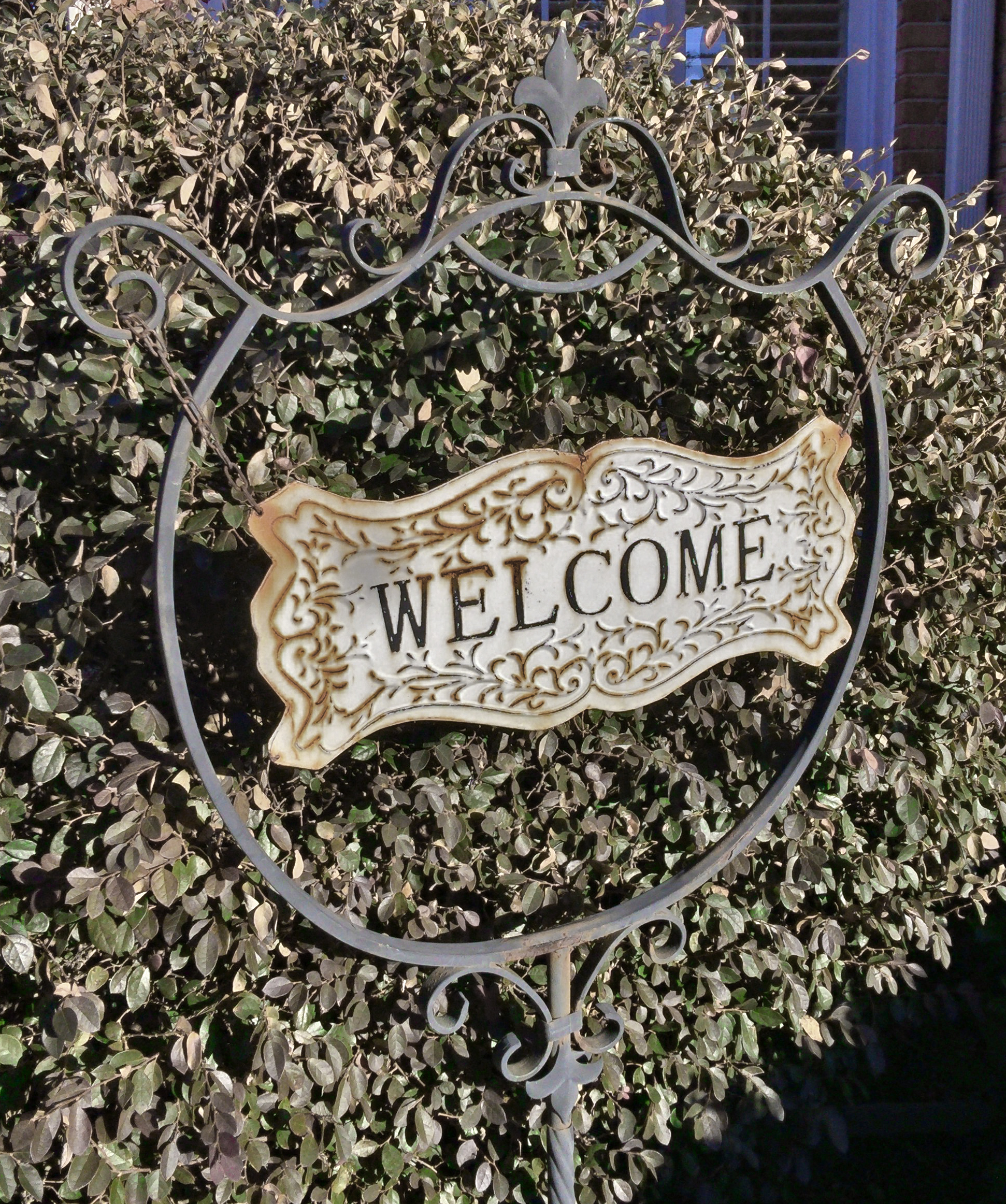
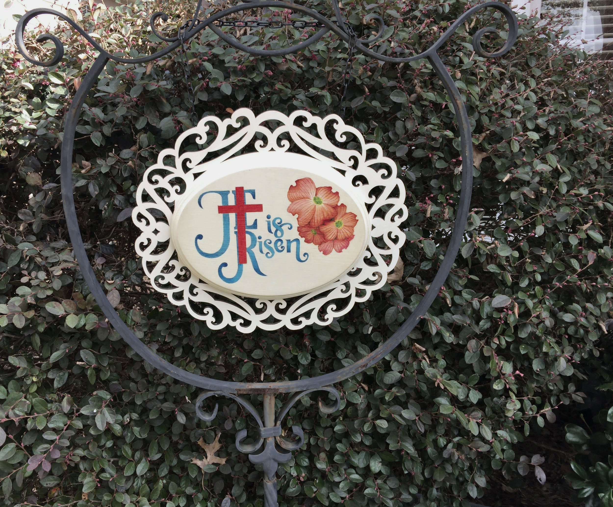
This is the frame where we hang our garden signs. In this photo it’s the dead of winter and the shrubbery is looking a bit dull and the stand is hosting the default welcome sign. The maximum area available for a new sign is roughly 20" in diameter.

Laser-Cut Photo Frame
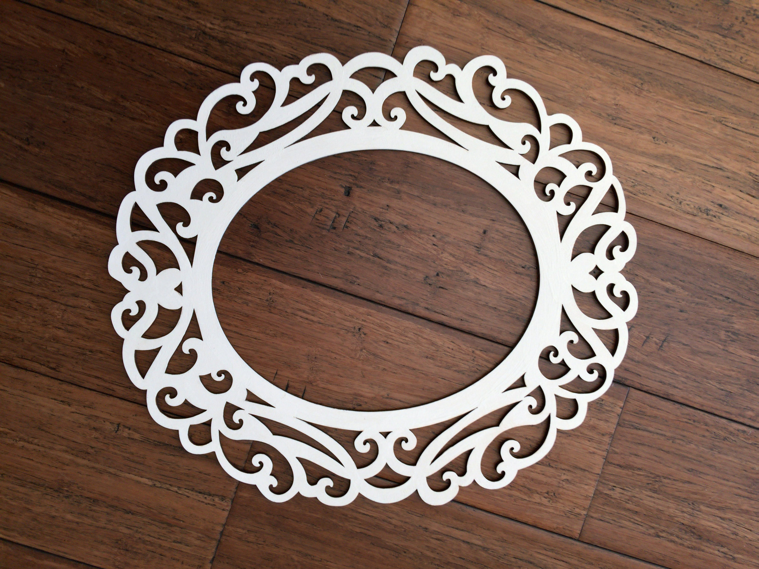
This flat, laser-cut photo frame has an interior opening of 8"×10" and an exterior of 14"×16" and was purchased at Hobby Lobby for about six dollars. It is a Woodpile Fun! brand item, SKU#: 1170539, and is called a “Natural Laser Cut Oval Wood Frame.” You can find it on their website via this link.
In this photo, the pine sheet has been given about four coats of Pure White Annie Sloan Chalk Paint. While all the edges have been painted black. This white matches the piece going in the center and will contrast well against the darker shrubbery that will be its background.

Wood Oval
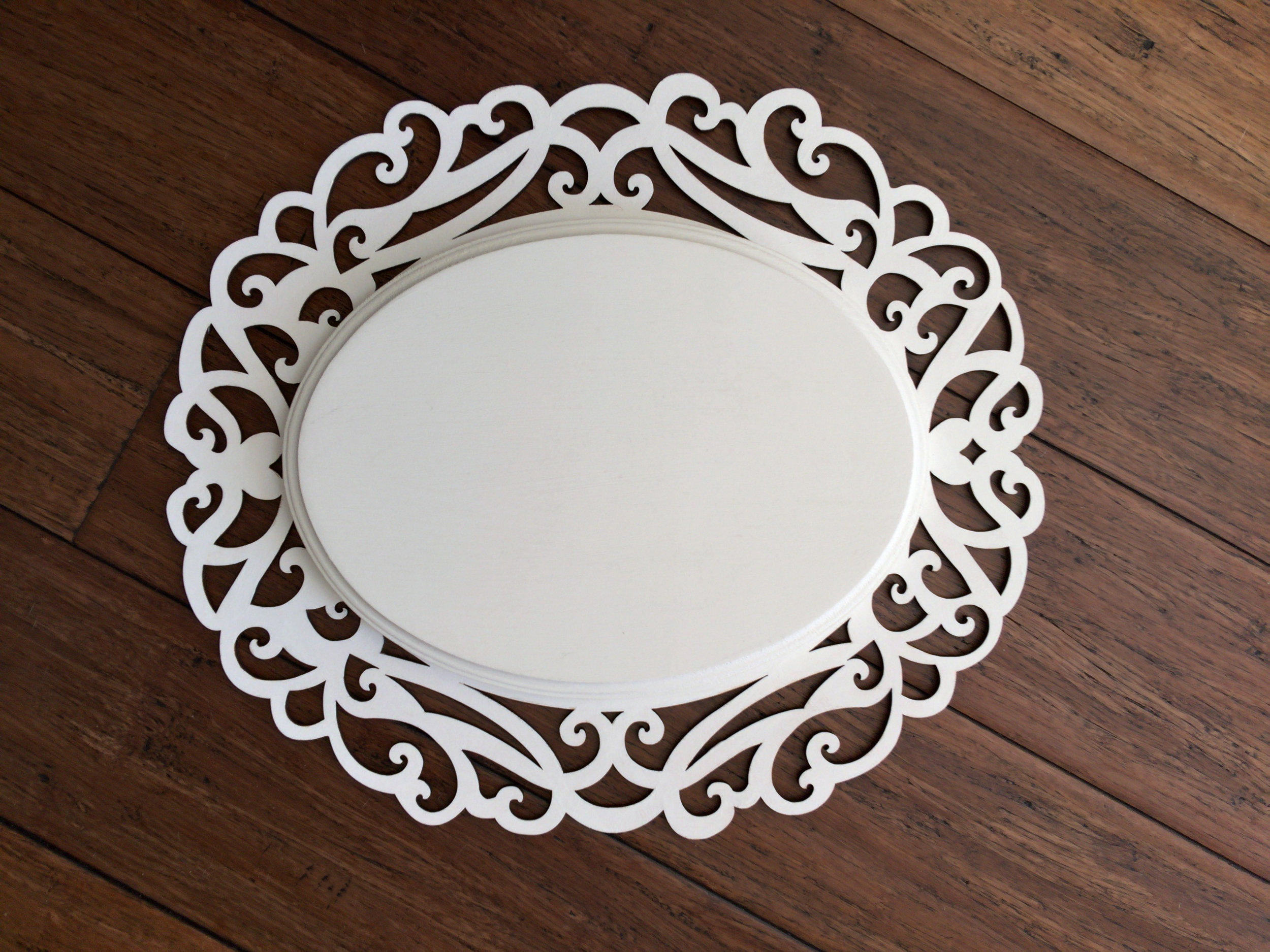
This photo shows the oval plaque positioned as it will be assembled with the scrollwork frame. Both were purchased at the same time to ensure size compatibility. The oval in the photo is about ½" smaller (in height and length) than the 9"×12" oval wood plaque on Hobby Lobby's website selling for about three dollars. So, I’m not certain they are the same item.
The oval in the photo has a pretty “Cove Dupont” edge. Like the frame it is sitting on, it also has been given about four coats of Pure White Annie Sloan Chalk Paint. I’ve found this paint has enough tooth to take the Prismacolor Artist Pencils I’ll be applying to its surface.

Concept Design
Using Procreate with an Apple Pencil on an iPad, Pro I created and finalized the design. A time-lapse video can be watched on YouTube.
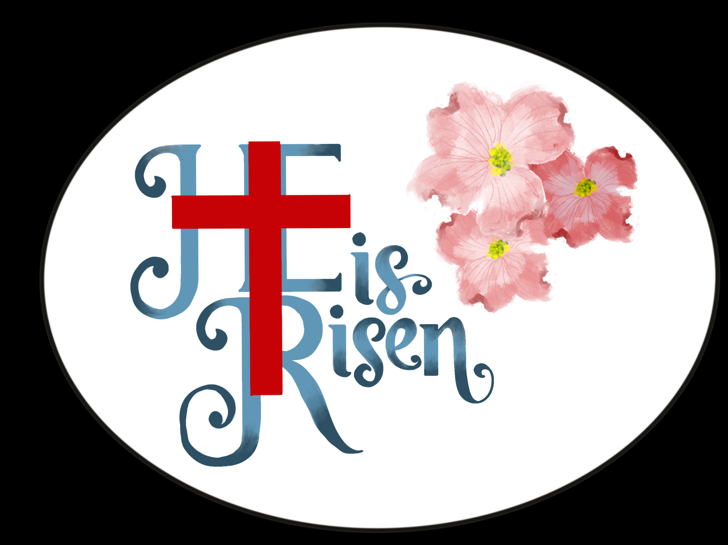
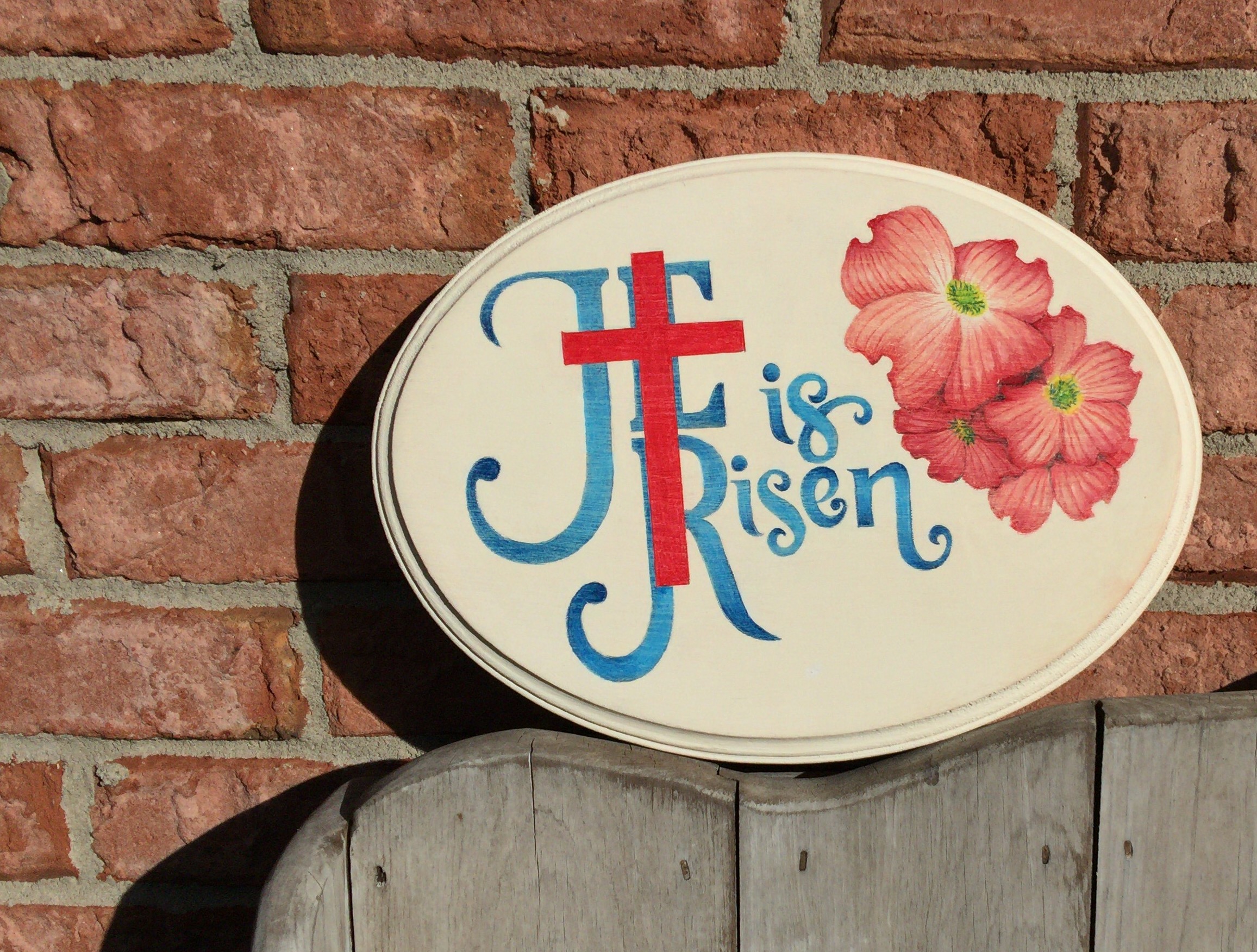
I initially considered the idea of a background that includes the garden tomb, with light pouring from the doorway after the stone has been rolled back. But the grey rock, context-setting geenery, and dawn-lit sky makes this small sign too busy and illegible. So I abandoned that path and instead balanced the composition with a cluster of culturally symbolic dogwood blossoms. Then I desaturated the blue lettering to compliment the dusty pink petals. And I shifted the clashing bright red cross to a richer crimson. To keep the lettering from looking too flat, a dark steely blue is faded into the loops and tips. I then create an oval outline using a photo of the wooden plaque—to ensure the proportions match. I then import that oval drawing and fill the outer area with black. Lastly, I arrange it beneath my work to approximate how the finished sign should look.
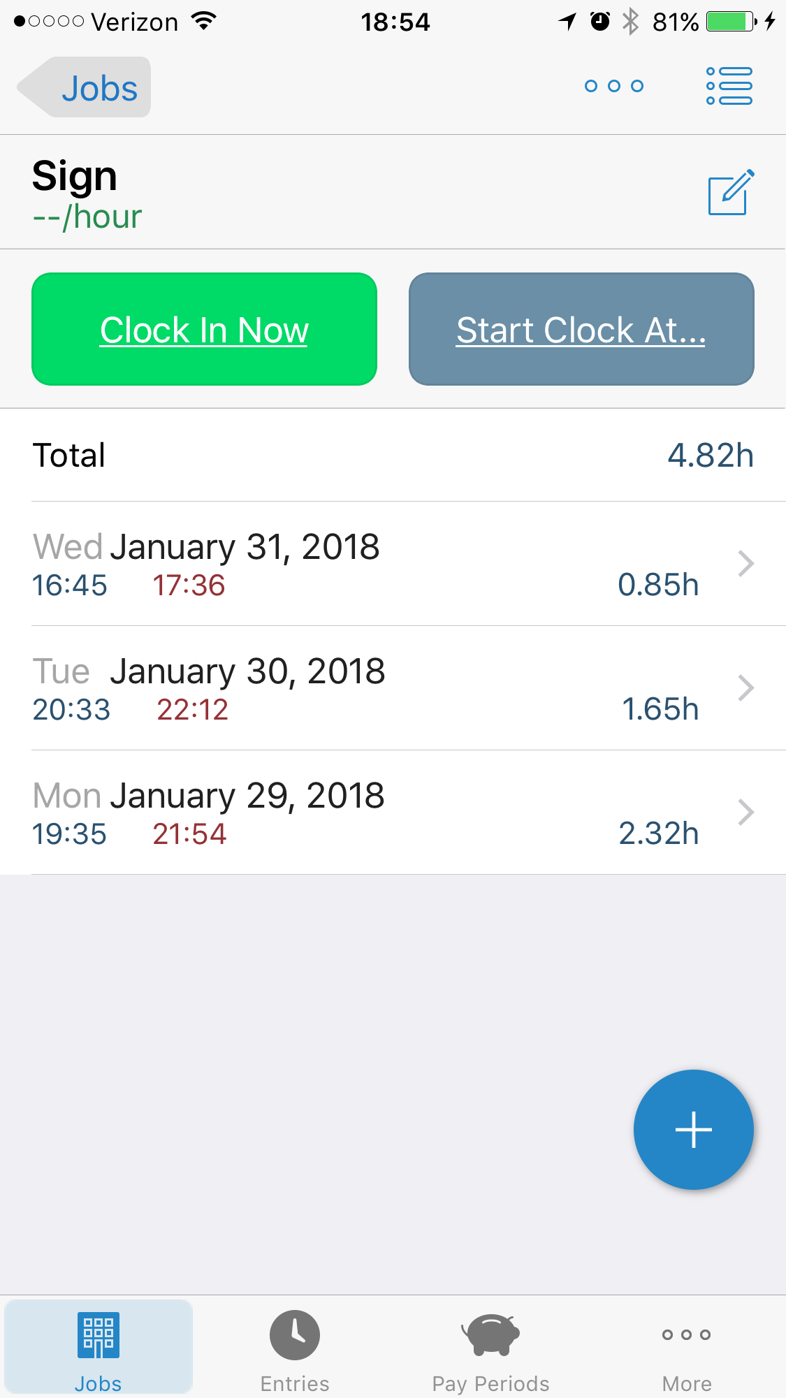
01/29/2018 duration 2.32 hours

Getting Organized
I track project time using the iOS app HoursTracker (by Cribasoft, LLC) so I can answer the question “How long did that take?” or to determine the value of a piece. This wonderful app can manage multiple projects, assign different rates, and track mileage (e.g., for commissions). I’m only interested in durations for this project, so I set the rate to zero, and each session begins with a clock-in and ends with a clock-out.

Pencils Cases
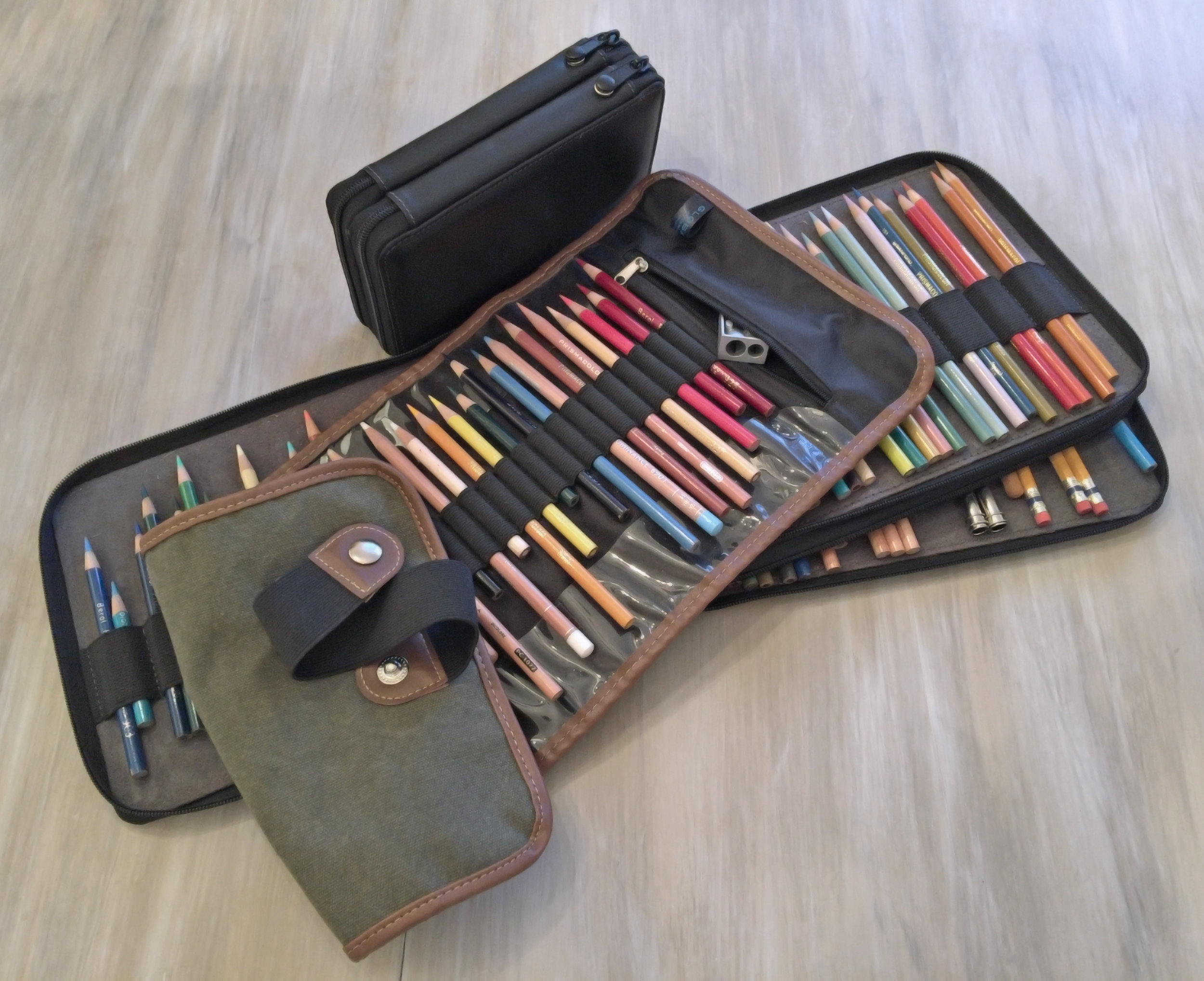
My first step is to organize my tools. Because my Prismacolor Artist Pencil collection is so large, I store the overflow duplicates and spares in the original tins and boxes. But I organize the “main” set by number in zippered pencil cases made by Global Art Materials (see sidebar). These come in leather and canvas cases ranging in size from 24 to 120 pencil capacities. I use a variety of case colors and materials to organize my tools by type: colored pencils, graphite pencils, liner pens, brush pens, core erasers, etc. and by colorfastness. As I build my tool and color palette, each item is moved to a canvas roll-up. This “project” roll-up has a capacity of 36 pencils, a zippered pocket for erasers and sharpeners, and is also made by Global Art Materials. Using a dedicated case allows me to quickly resume work since I only need to grab the project roll-up.

Color Swatch Cards & Books
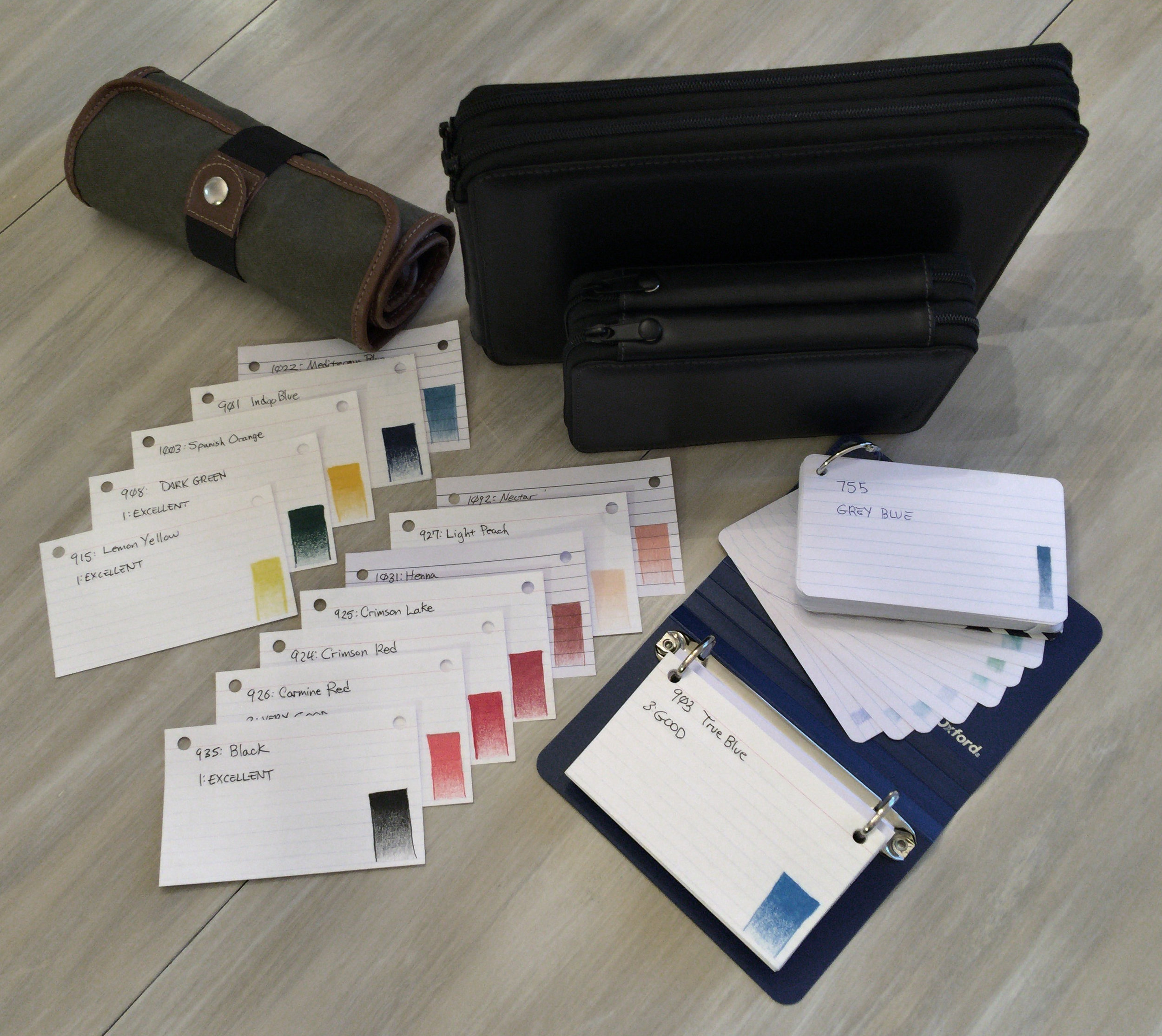
To select my colors, I use a homemade swatch book. This is an important tool each artist should make for each of their mediums. The term “medium” refers to the technical definition of “a substance used to make a transmission.” The word medium is used by artists because a pigment is “transmitted” to a surface via oil, wax, acrylic, etc. For my project, the primary medium is wax-core colored pencils in the Prismacolor Premier series. Different brands and even different series should have different swatch books.
The paint on the wooden casing of a colored pencil can be wildly inaccurate. Even the pencil tip can be deceiving. You have to apply the medium to paper, at different pressures, to really see the colors it creates. I use 3×5 index cards to record the color name, pencil number, lightfastness rating, and a gradient swatch (i.e., at varying densities). I keep all the colors for a particular brand or series in its own binder, ordered by number. This gives me the flexibility to remove, arrange, and compare swatches to ensure harmony.

Color Tests & Palette Validation
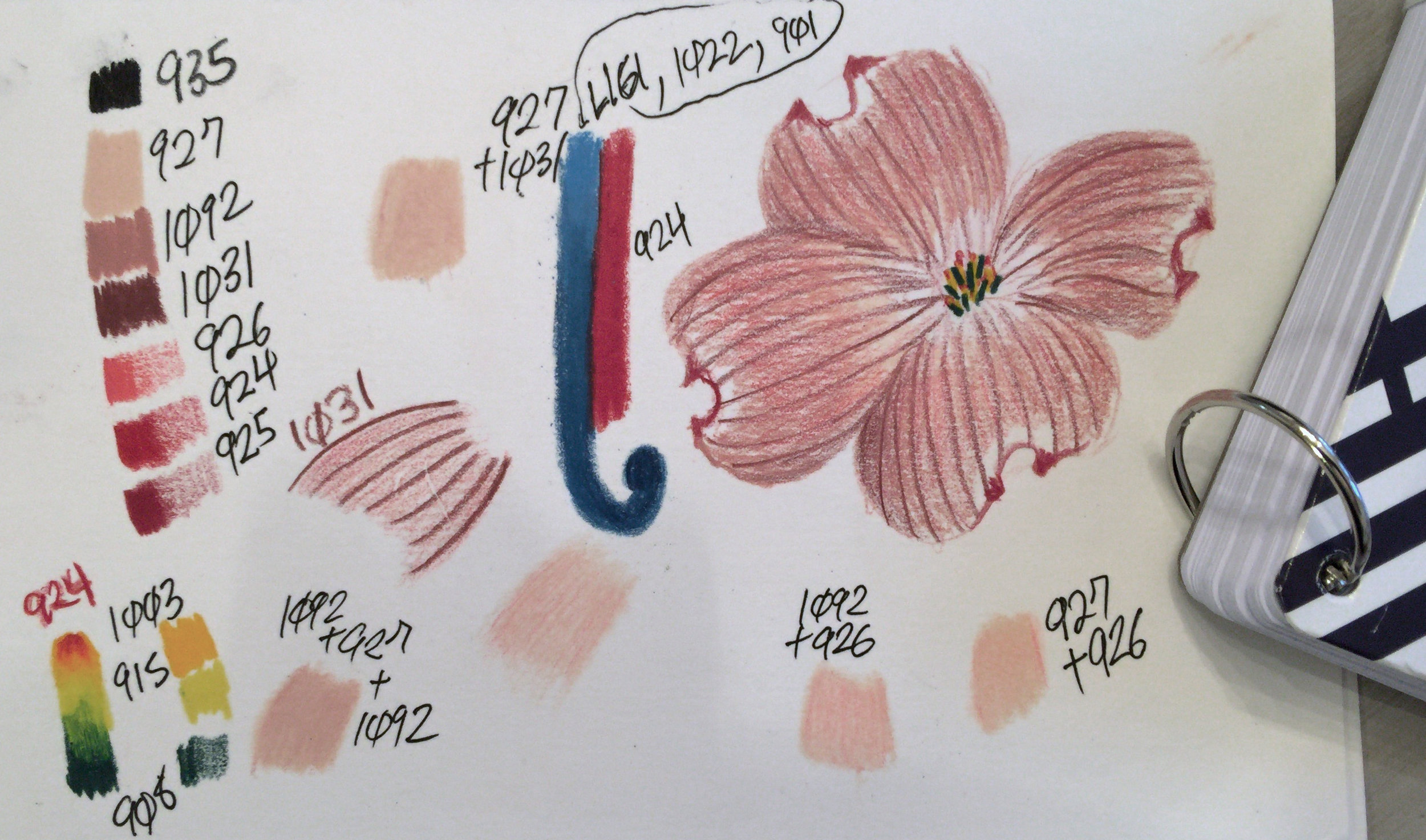
I refine the initial selection by pulling the corresponding pencils from storage, laying their color down on paper, and next to each other in the same densities and proximities they will have in the finished piece. The confirmed palette then goes into the project roll-up sorted by color—everything else goes back into storage arranged by number.
For this project, the Prismacolor line didn’t have a suitable pink with sufficient lightfastness. But some layer trials identified combinations that I can use instead. Also lacking in the Prismacolor line is a wide spectrum of lightfast blues. So I’ve had to supplement my palette with Gray Blue from my Caran D’ache Luminance collection. These expensive pencils (about $3 apiece) I tend to reserve for fine art versus craft art projects, but my need justified the exception.
Shading and highlights should typically come from layered colors and not from the application of black or white. But I include white and black in project palettes by default “just in case.” Sometimes you’ll need an exceptionally white highlight, or need an edge which justifies their inclusion. I include two different whites: Luminance White has a higher opacity, while the more transparent Prismacolor White can be used as a blender that also lightens. The Prismacolor black is sufficient for this and most projects. Had I needed really fine black lines, I might have included a Faber-Castell Polychromos Black pencil (oil-based) or an ink pen.
Below is my palette by pencil number and color name.
0755 Gray Blue (Caran D’ache)
1002 Mediterranean Blue
0901 Indigo Blue
0908 Dark Green
1003 Spanish Orange
0915 Lemon Yellow
0927 Light Peach
1092 Nectar
1031 Henna
0925 Crimson Lake
0924 Crimson Red
0926 Carmine Red (for light layering only for saturation boost)
0935 Black
0938 White
0001 White (Caran D’ache)
1077 Colorless Blender
01/30/2018 duration 1.65 hours

Even Artists Must Maths
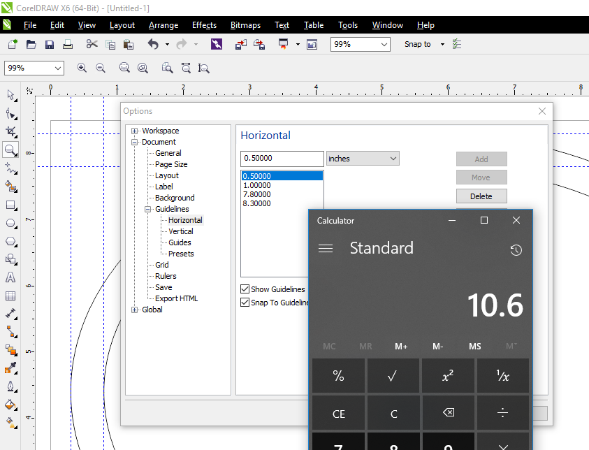
I could freehand everything, like I did in the concept drawing made with Procreate. But even that app has a straight-line feature I used for the cross and for the verticals & horizontals in the letters. Since I already have a vector drawing program handy, why not use it? In this photo, I’m setting up an oval in CorelDRAW that’s the exact same shape and size of the wood plaque. I’m adding a suitable margin and inside that I’m going determine the best position for the cross and capital letters. These elements have most of the straight edges in the planned artwork. I will then print them out and transfer their outlines to the target surface so the proportions and relations are normalized—thus avoiding the “uncanny valley” effect that results from lettering that’s just a tad off.
Note: I’m using the older CorelDRAW Graphics Suite X6 from 2012 that is 3 versions behind. I had to hunt down and apply all three vendor patches in order to make it usable on Windows 10 (the menus were white on white—basically hidden). The current version is CorelDRAW Graphics Suite 2017. I didn’t want to spend the money on the upgrade (yet). But more importantly, I didn’t want to spend all the time it would entail (uninstall old version, install new version, learn new version).

Wireframe Vectors
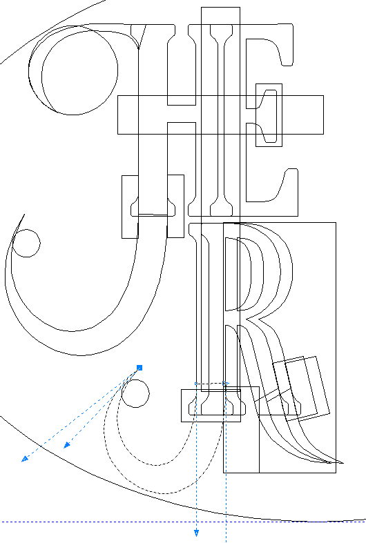
In this screenshot I've finished creating all the vector objects in CorelDRAW and positioned everything so it’s inside my margin boundaries. This wireframe view shows the complexity behind the creation process. I’ve purposely left the serifs unfinished, since I’ll do that by hand on the actual artwork, and refining them in software would take too much time and effort to justify. I only need the basic curves and circles, which act as guiding milestones.

Rendered Vectors
In this image I’ve switched from a wireframe view to a normal rendering, exported it as a PNG, and used Paint.NET to do a tiny bit of cleanup so I can show you what my mind is seeing. I also exported the work to PDF and printed it in grayscale, and that sheet will be used to transfer the outlines. During this process I used mostly the mouse for vector work, but would switch to my Wacom tablet for the raster work.
02/01/2018 duration 2.25 hours

Transfer
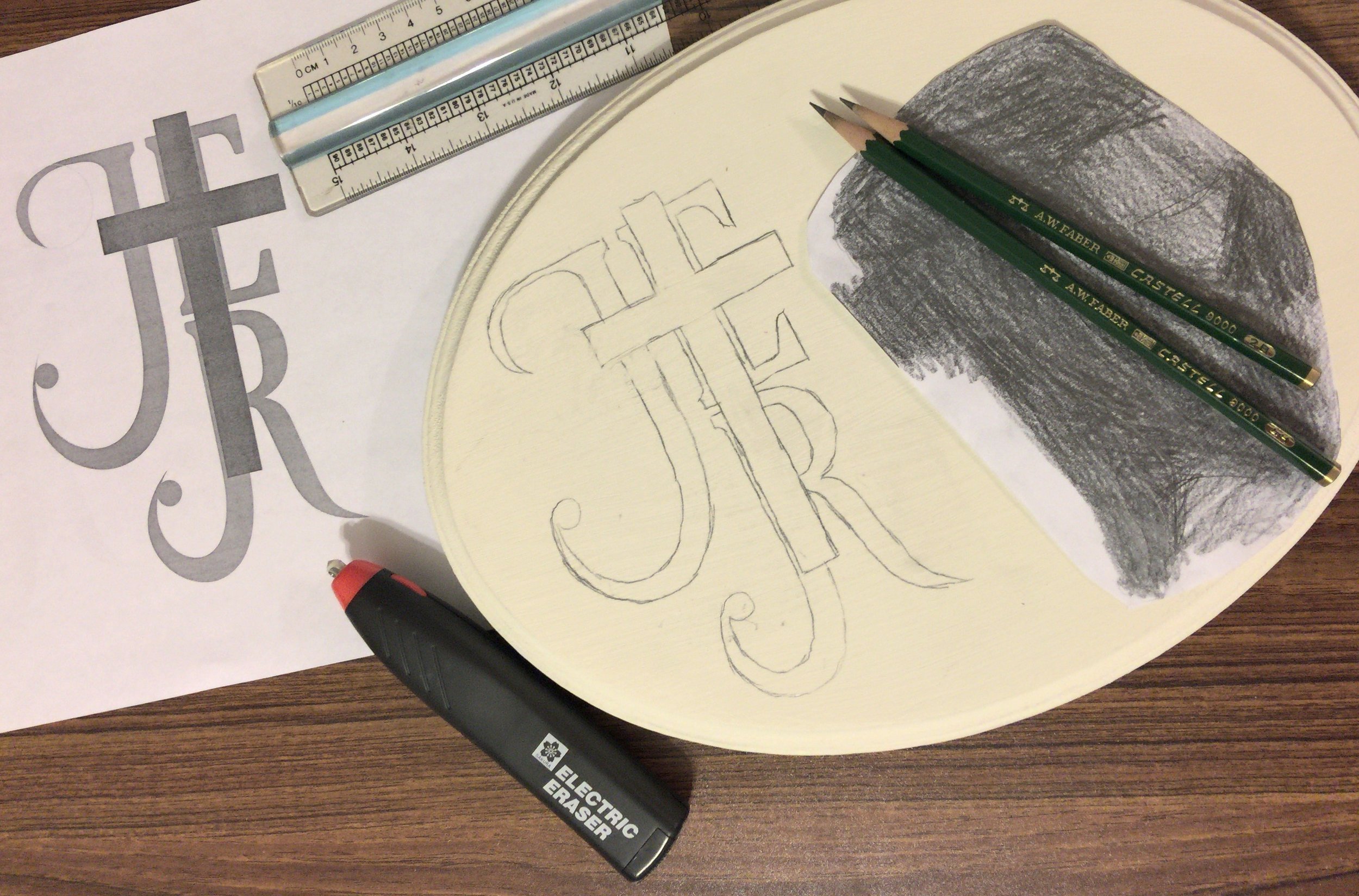
I printed a couple of copies and on one cut around the design, so it would be easier to align on the plaque. I coated it with graphite using a 2B pencil, which is easily soft and dark enough for transfers. Softer leads are more likely to stain and can be difficult to erase cleanly. With the graphite side down against the plaque, and the design facing up, I traced all the lines with a firm hand. I used a freshly pointed, strong, and hard 4H pencil. I then cleaned up errant graphite dust, smudges, and marks with a Sakura electric eraser.
02/02/2018 duration 0.45 hours

Sketch in Elements
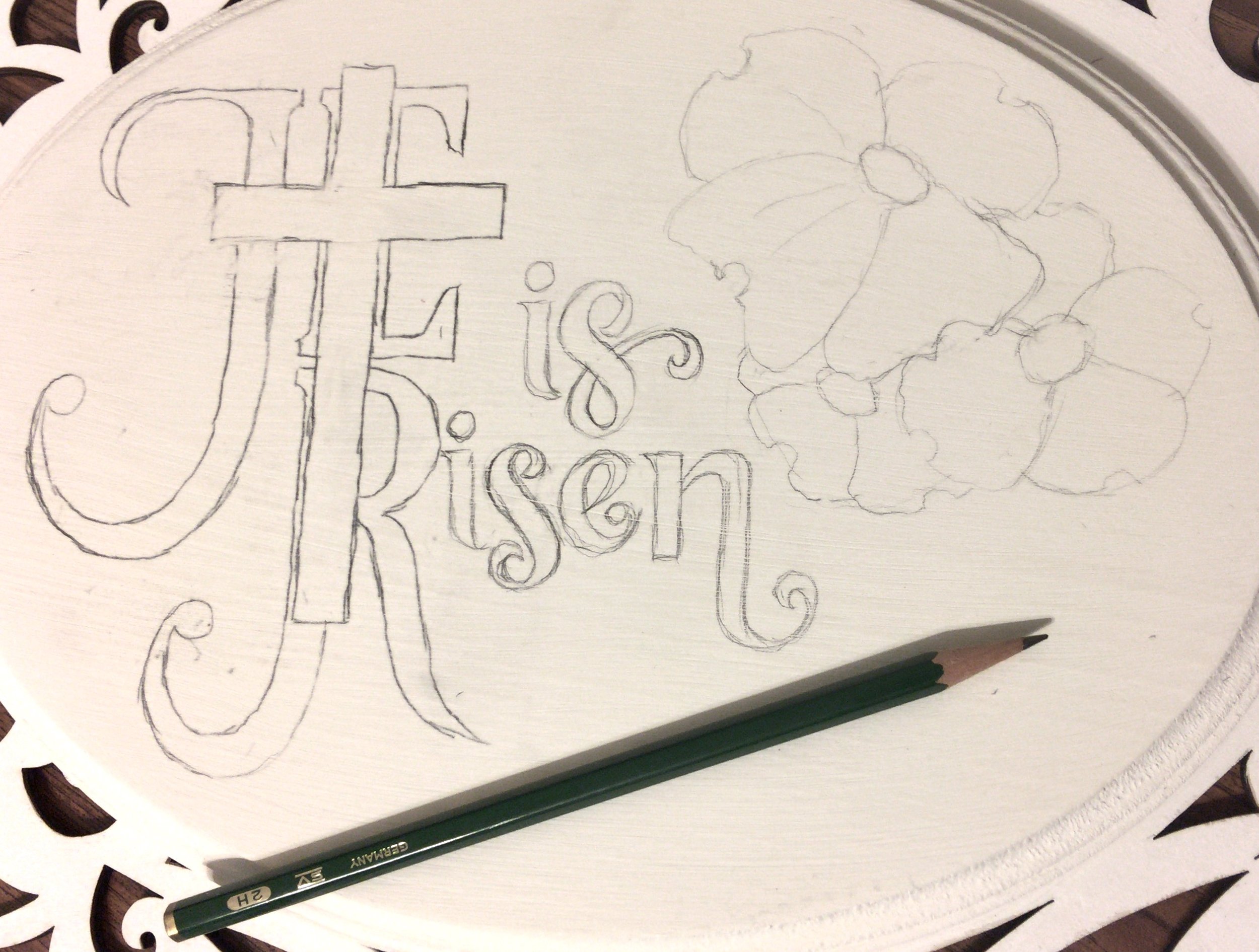
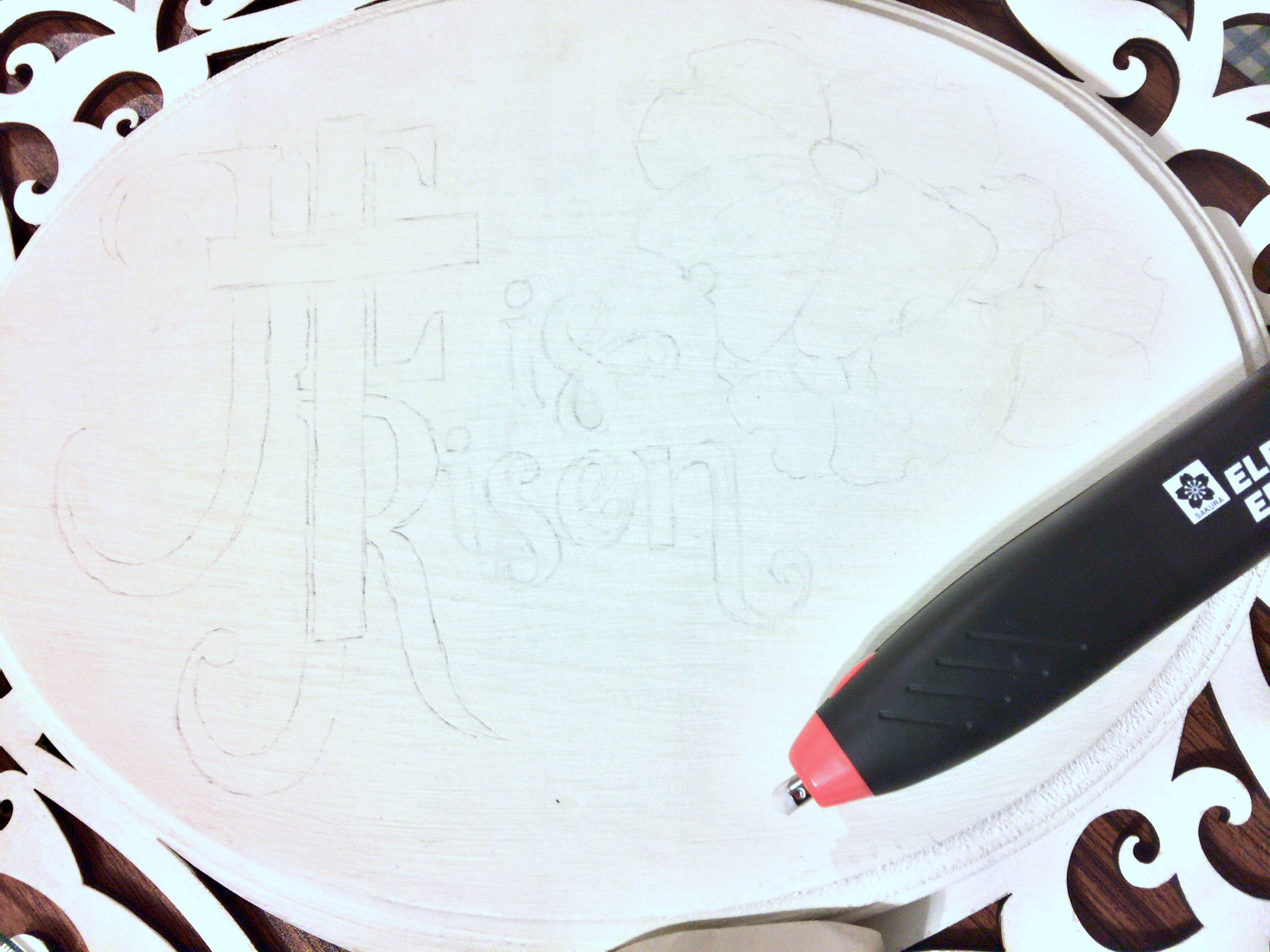
The remaining letters and blossoms are sketched in. I use a 2H pencil since I want lines that erase well.

Erase Everything Erased
After finishing the sketching, I erase EVERYTHING. The graphite will stain the colored pencil, so I want only the faintest of guidelines. I use a Magic Rub eraser to do the bulk erasing. Then I switch to the electric eraser to do spot work such as lightening darker line sections or to clean the tiny valleys created by the paint grain.
02/04/2018 duration 0.42 hours

Dark Tips
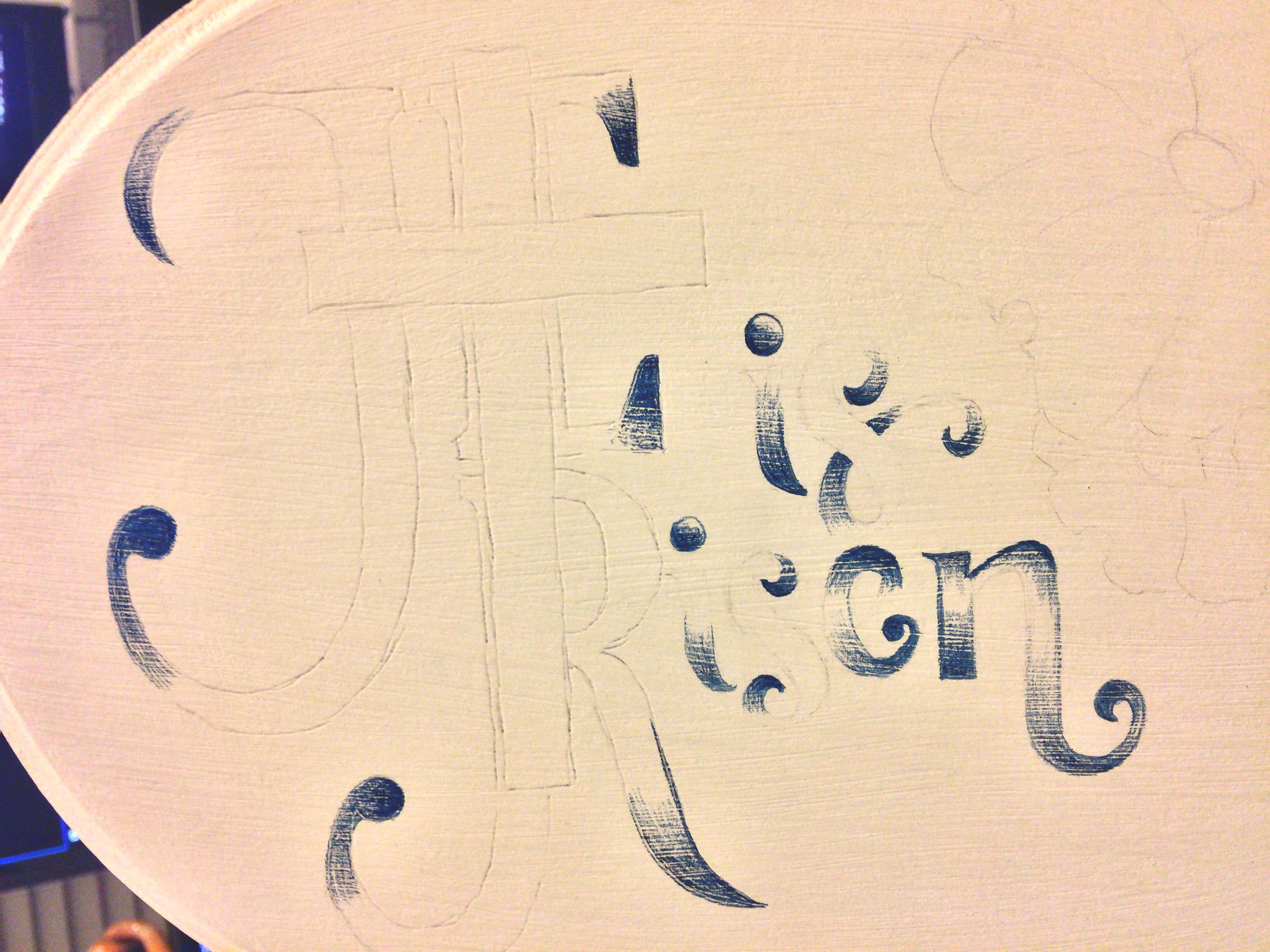
I'm working from dark to light, so I put down Indigo Blue at the tips of the letters using a freshly sharpened pencil.

Lettering Finished
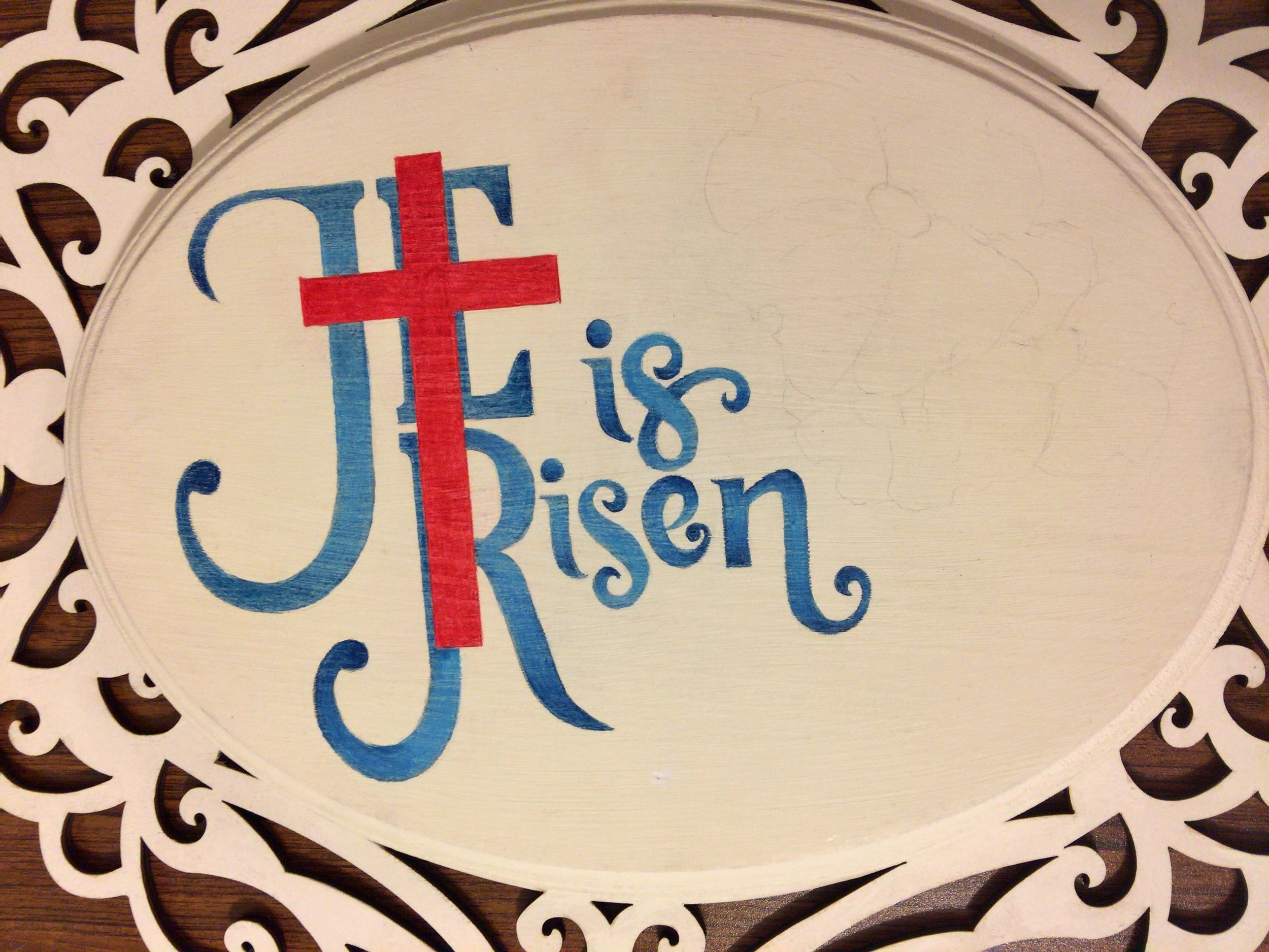
Caran D'ache Luminance pencils are softer than Prismacolors, and don't hold a point as well. Therefore, I put the Gray Blue down for the larger sections of lettering and avoided the edges. The edges were mostly Mediterranean Blue, sometimes with a touch of Indigo Blue. And I used Prismacolor White in a couple of small spots to blend the Indigo Blue where it made too harsh of a contrast. The cross was Crimson Red. All Prismacolors were kept sharp to keep edge work as crisp as possible, and also to allow the color to reach the valleys of the paint grain and wood grain.
A ruler was used for the the long straight lines. Remember to wipe the ruler edges with a paper towel or tissue after each use to remove any color that can smear onto your work. Also there will be crumbles from heavy layering, and those should be removed with a blast of air. Don't use an artist brush or anything similar, which can smear the crumbles.
A couple of lines needed cleaning and I used a ordinary school pencil's pink eraser (because of it's gritty qualities). I would rotate the eraser with each stroke to ensure it didn't smear any color picked up from the previous pass. And I'd scrub the eraser onto scrap paper to remove all accumulations.
02/05/2018 duration 2.05 hours

Materials Compatibility Test
Sunshine and 60s combined to grant the opportunity at a material compatibility test. A space heater supplemented the sun to make the requisite 70°F and the February air meant humidity wasn’t even remotely an issue. The test subject was already prepared with Annie Sloan Chalk Paint Pure White on a pine board, each color as a line and a gradient, and three coats of Prismacolor Final Fixative Matte. So, today’s test was the final phase of the test to apply Krylon UV-Resistant Clear Matte Acrylic.
For each “coat” I’d pass the spray can back-and-forth across an unmasked band of the sample six times using the same disciple and technique that would be applied a finished work. Then I would wait the required 15 minutes before repeating the process. To conserve time, I began shaking the spray can at the 13-minute mark, so it’d be ready to apply when the timer sounded. The process was repeated four times, giving a total of 24 passes. This beyond what would be required for material testing and was done to get an idea of how many “coats” it would take to create a decent protective shell. Because each pass is made at the suggested 12-inch distance and the can is moved in a consistent manner, the layers are very thin to prevent any dripping or clumping. You might expect 24 passes to make for a decent shell, but the resulting finish was extremely difficult to discern. Consequently, I’ll be applying more coats on the finished piece.

Test Closeup
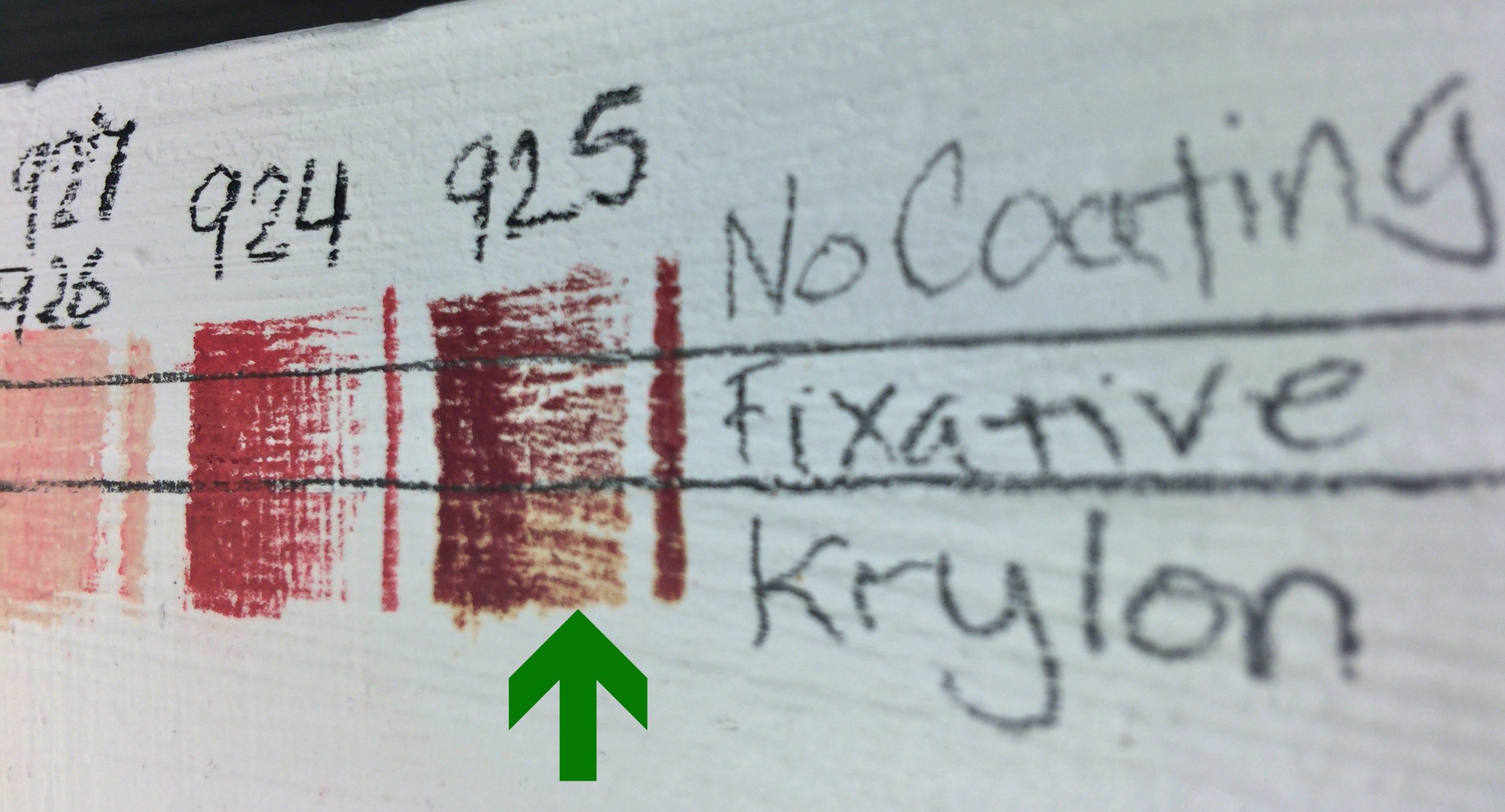
Speaking of results, the compatibility was excellent. In the photo the top stripe is all the colored pencils without any protective coatings. The second strip (and below) is four coats of final fixative. And the bottom stripe is the four coats of Krylon on top of the fixative. If you look very closely (see green arrow), there was a tiny bit of leaching of Crimson Lake. I think additional coats of fixative might address that. It certainly won’t be noticeable in the use case planned for this piece.
02/06/2018 duration 1.35 hours (which includes 4 cycles of 13 minutes waiting for the prior coat to dry).

Dogwood Blooms
As the dogwood is one of my favorite flowers, it wasn’t hard to find some reference images in my photo collections and their four-petal construction is very familiar me from frequent study.
Did you know the “petals” of a dogwood aren’t really the flower? They’re a type of leaf called bracts. The flowers are actually the cluster at the center. Each of the tiny stems open up to a tiny yellow-green flower with four petals, four stamens, and four sepals. All this detail is hinted at, with radiating lines of Dark Green, spots of Lemon Yellow to represent the closed flower heads, and Spanish Orange for the the section below the heads.
The bracts were started with Crimson Lake at the outer central divot with the gradient dark zones in the center and in areas of shadow as an under-painting. As is typical, I work from dark to light, so I next add a faint layer of Carmine Red to add saturation and a pink cast to the blending. The top layer was Light Peach, with midtones in Nectar, and even darker with Henna. The vein ridges are Crimson Lake, Henna, and Carmine going from the outside to the inside of the bracts and to contrast according to the color they’re crossing. The shadows didn’t have enough dynamic range and looked flat, so I needed deeper shadows. Indigo Blue was in the wrong palette direction and I wanted a warm color for those shadows. So I went back to my swatches and Burnt Umber (947) fit the bill. For highlights at the arch of the petals I used the Prismacolor White to add subtle depth.
02/09/2018 duration 2.06 hours

Spraying Booth
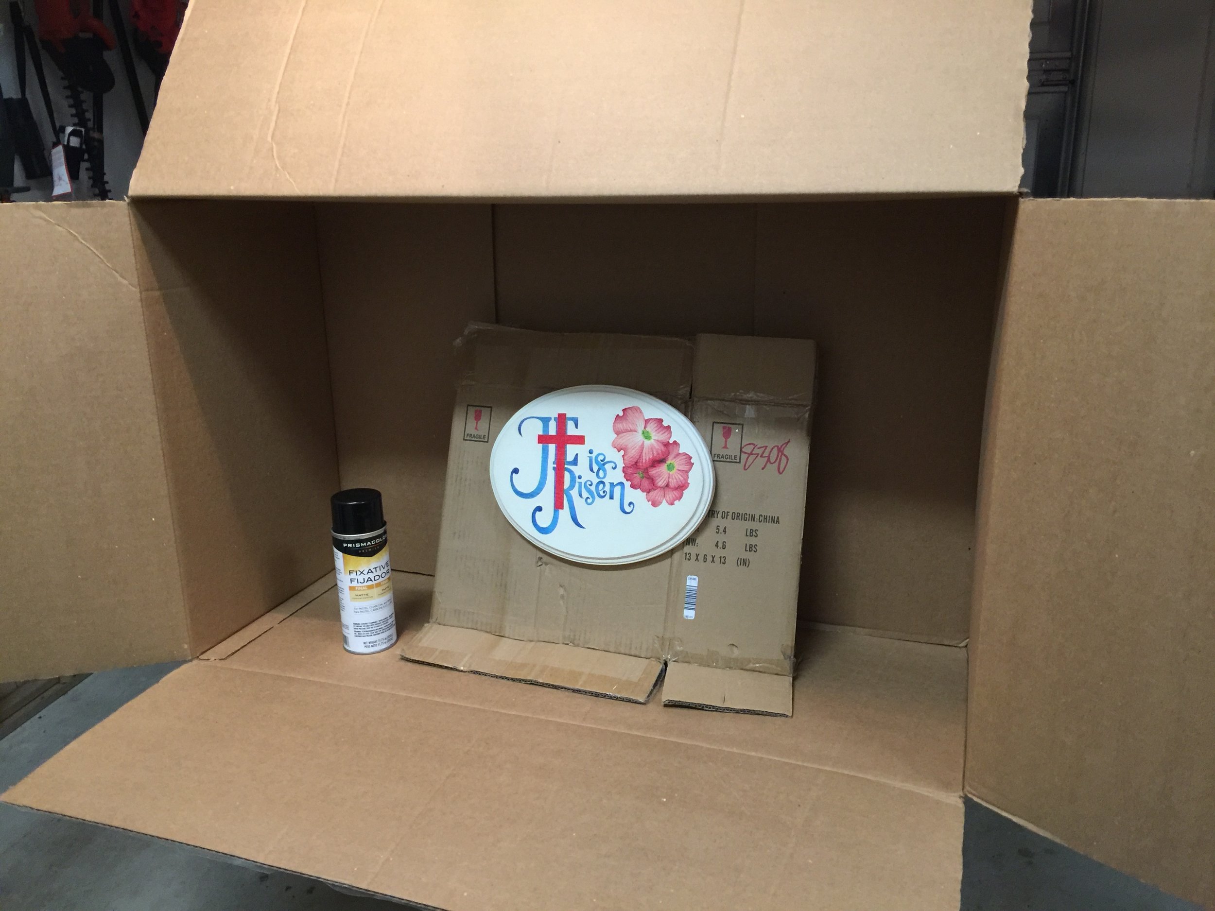
A large cardboard box makes a great spray booth to control overspray. I put a couple of short wood screws into the back of the plaque, protruding enough so that I could puncture a sheet of cardboard. This made a stable prop that holds it at the optimal angle and height.
Technique is very important to get good results, which includes following the manufacturer’s safety and usage instructions. Most sprays look best if you layer multiple light coats instead of fewer heavy coats. Your arm, as it moves the spray can back-and-forth, wants to move in an arc. This results in the can being father away at the beginning and end of the arc, and much closer at the apex of the arc. Instead, keep the can’s path PARALLEL to the target surface. Also, start the spray BEFORE the leading edge of your target surface. And continue spraying PAST the trailing edge of your target surface. If you begin spraying while the can is in front of the piece, then it can result in a sudden heavy blast or globs that may have formed on the head or in the nozzle. The goal is to lay down the spray is a consistent density without excessive overlaps. This is much harder to accomplish with a piece laying flat on a table, so work with it held securely, vertically, and facing you about eye level.
Also work in an area that’s warm and dry enough. No matter how careful you are, or how dead the air seems, ALWAYS expect overspray. Even with a spray booth, I never fully trust it will catch every stray wisp and particle. Never finish a piece with a vehicle or other important item in the garage because you can bet some spray will drift and settle on it! The same goes for working outdoors, and you need to be far away from any vehicles, windows, furniture, etc.

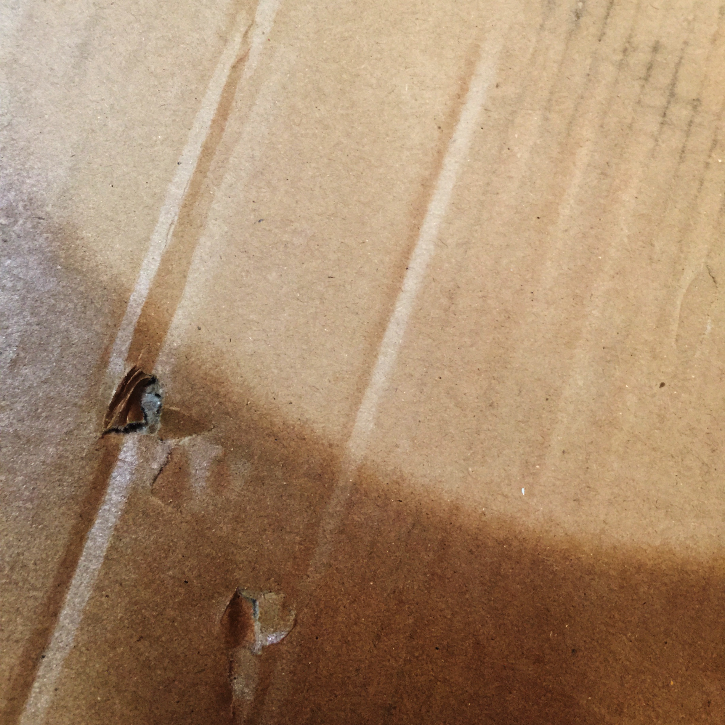
Nice Shell
A closeup of the cardboard to which the plaque was attached. A light coat was applied with a five minute dry time between each session. There is no clumping or dripping and the many light coats have built up a nice sheen, giving confirmation of proper technique.

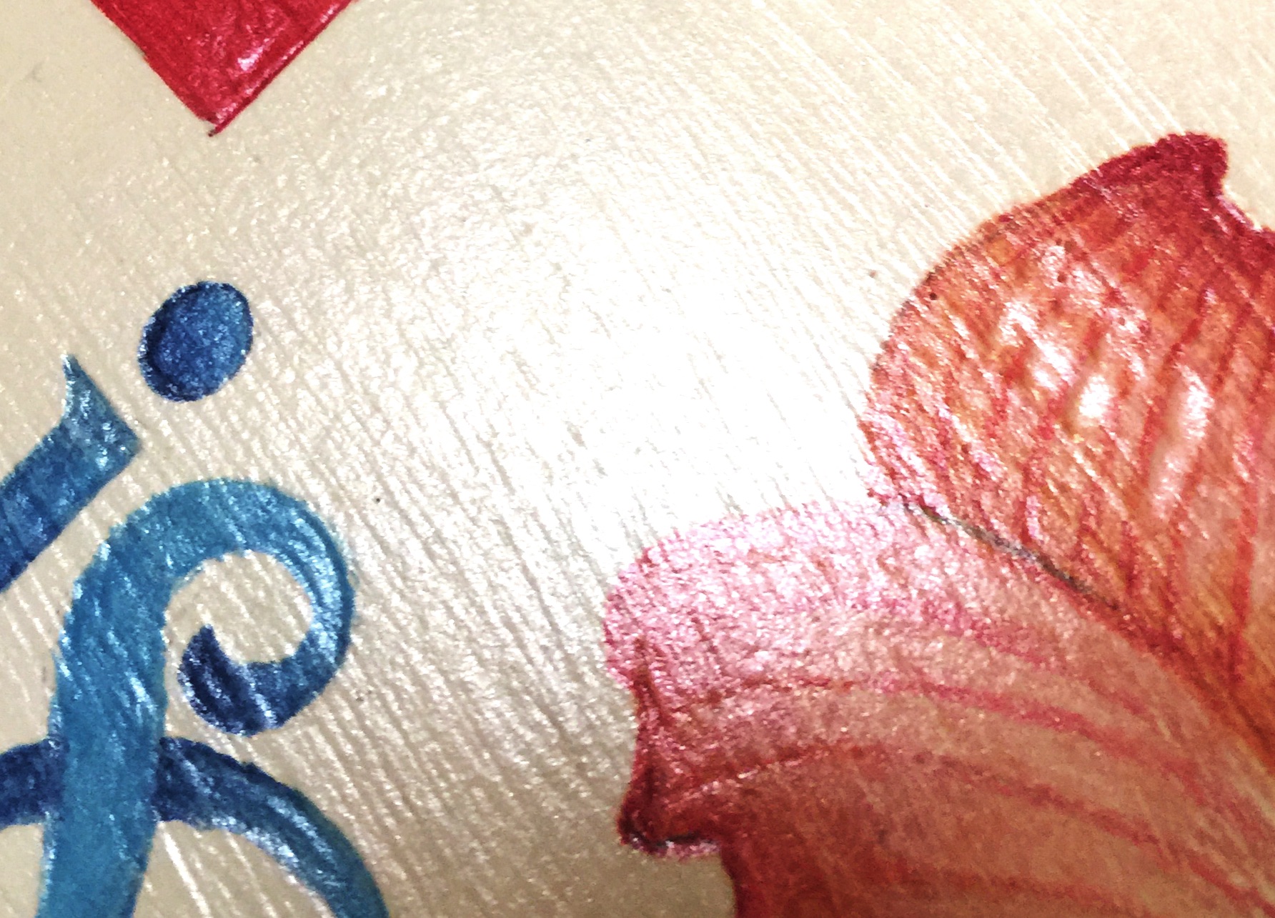
Nice Shine
A closeup of the plaque after the fixative coats were applied. I’ve purposed angled it in this shot to pick up the light and emphasize the shiny shell that’s been started. The fixative is not the actual protective shell, but a barrier between the color and the acrylic spray that will be applied after a few days when the fixative is fully cured.
02/15/2018 duration 0.78

Mirror Holders
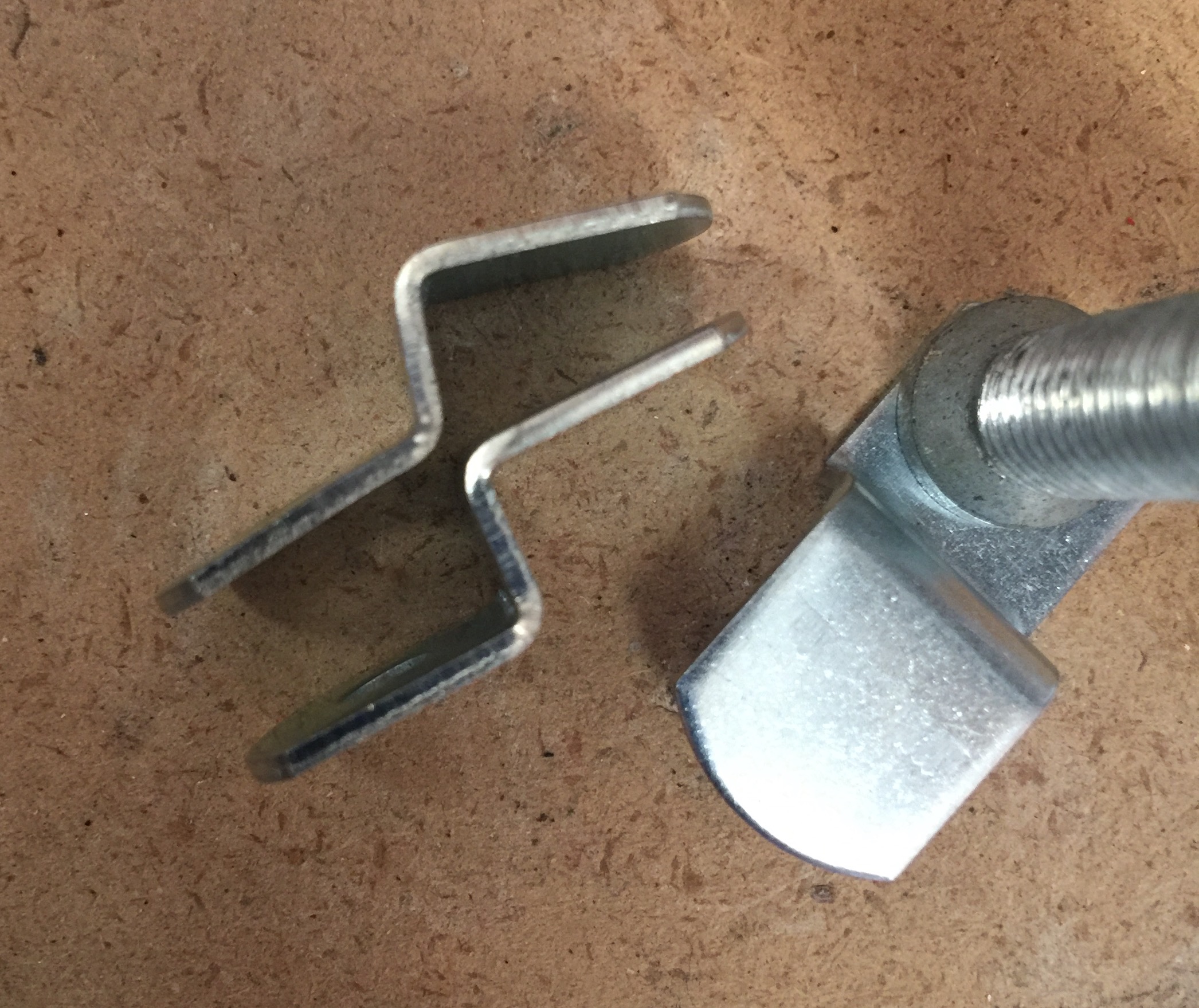
Saturday developed in a warm day with sunshine in the afternoon, so I used the opportunity to apply the final protective coat of Krylon acrylic. Fifteen minutes between sprayings meant I had plenty of time to also prepare the hardware. I had a set of four of the Hillman holders for ¼ inch thick mirrors of 20 pounds maximum (item #121155). Instead of using them as load bearing, I wanted to change their right angles so they’d pinch the decorative frame and hold it firmly to the oval plaque. In this photo I’ve place two holders on their sides. The one closest to the upper-left corner was bent to the desired angle. The holder just just below that still has right angles and needs to be bent. The right-most holder is clamped to the work table with a C-clamp and ready for hammering.

Before Bending
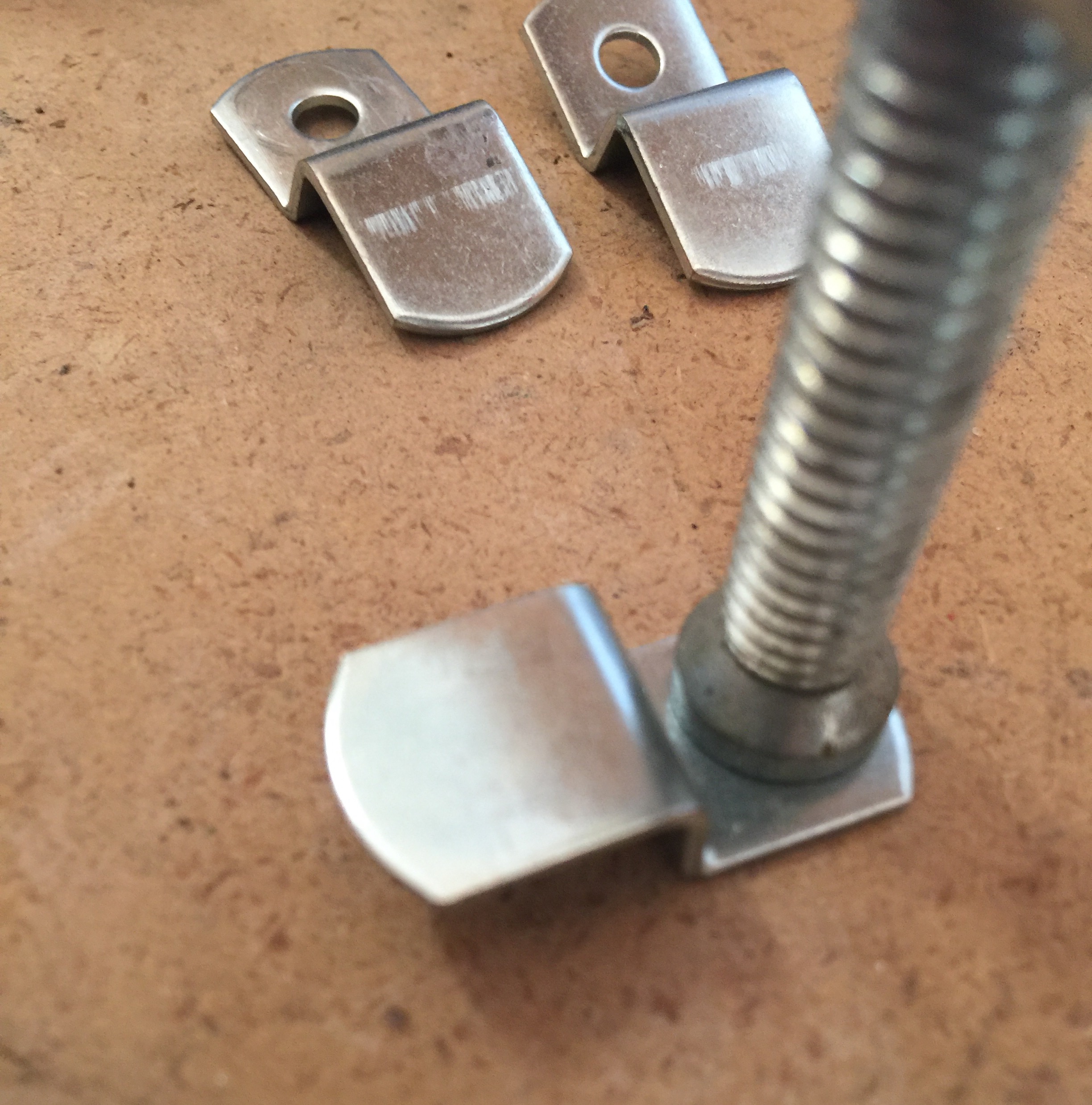
In this photo you can see the holder held by the C-clamp before the left-most edge is bent down.

After Bending
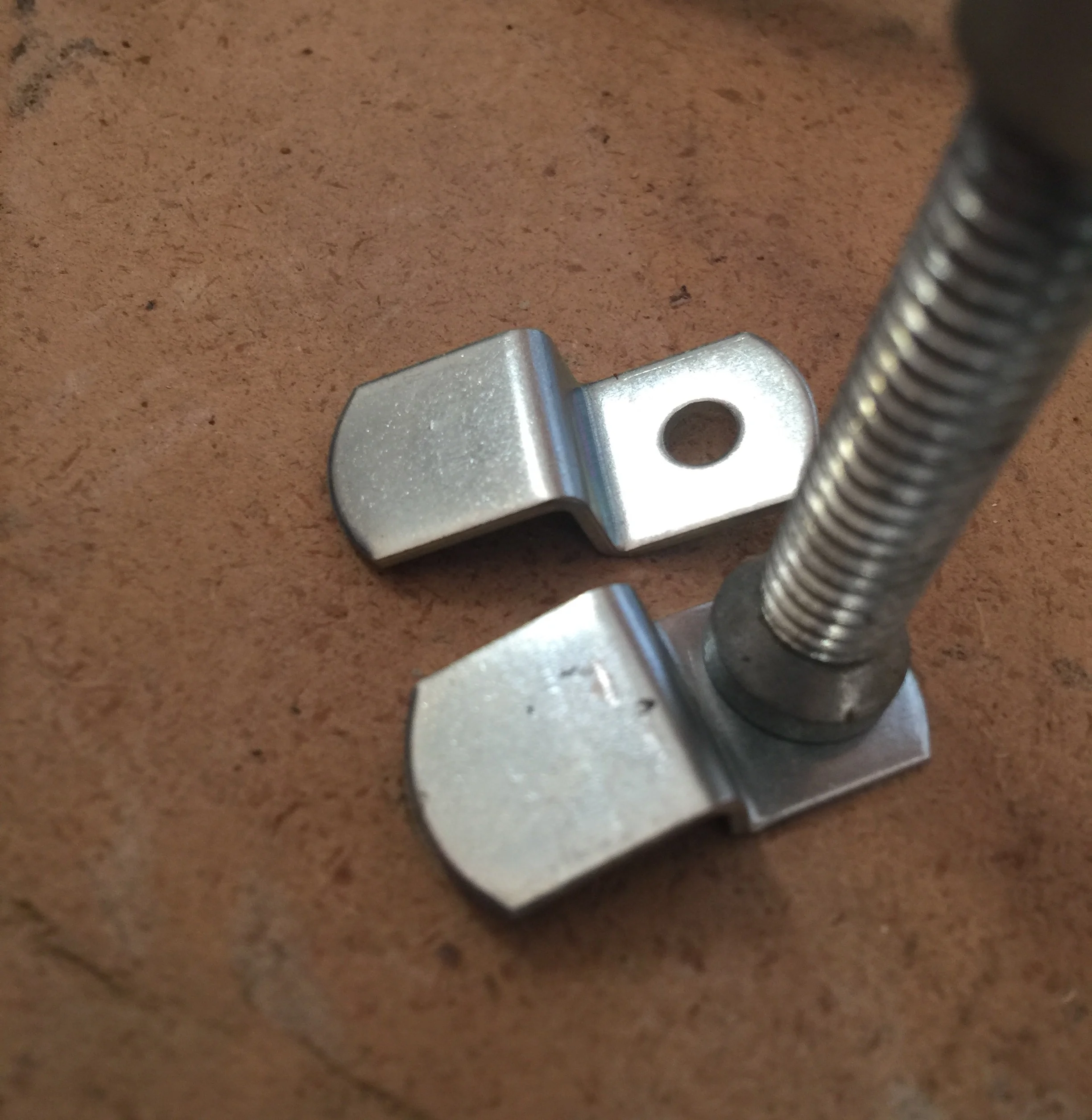
In this photo I’ve hammered the tip down so it will pinch the frame to the plaque when screwed into place on the plaque.
02/17/2018 Krylon & hardware adaptation session 1.63 hours

Back of Plaque
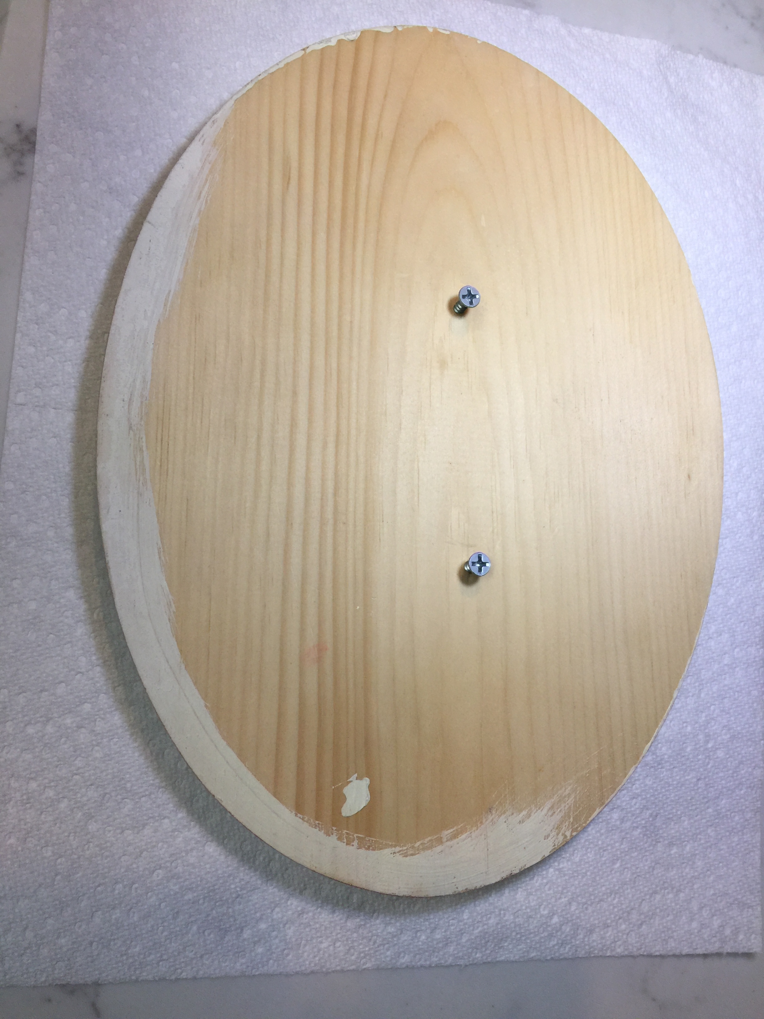
In this photo you can see the two wood screws that I used to puncture the cardboard so it would mount vertically for spraying. I will remove these now they are no longer needed. You’ll also notice I’ve placed the plaque face down on a paper towel so the artwork won’t be marred during the assembly process.

Assembly Complete
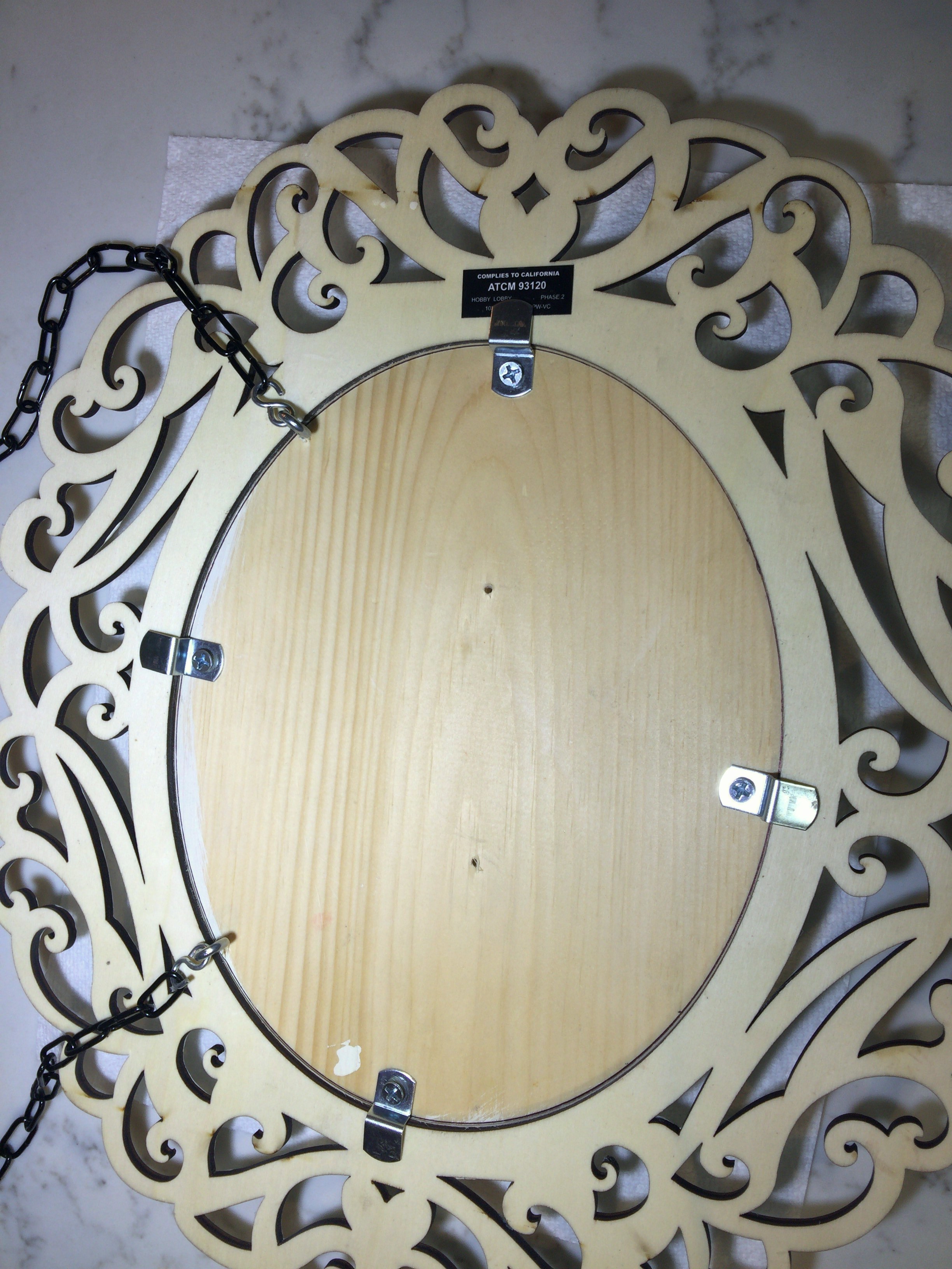
In this photo everything is assembled. If you look closely, you can see an inked circle on the plaque’s back. This was to ensure that I kept the frame aligned during the assembly. I used the decorative scroll work and the relation of each cut to the plaque’s edge to line up the two pieces. I then carefully flipped the two pieces face down without shifting. That took a number of attempts before I was finally successful. And the inked oval was the first thing I did because I knew something would be eventually be bumped out of place, and having the inked oval would make it easy to realign. The mirror holders were attached using #8 ¾ inch wood screws. The chain was attached using 5/64 inch S-hooks (by Blue Hawk, item #0656972). They connected to 1-3/16 inch screw eye hooks size #210 (by Hillman, item #490968).
02/17/2018 assembly session duration 0.87 hours

Finished
The last step was to do a trial mount and shorten the chain. Then the completed sign was put back into storage until just before Palm Sunday and the Easter holiday.
02/23/2018 duration 0.17 hours, giving a total project duration of 16.85 hours.
