Composition
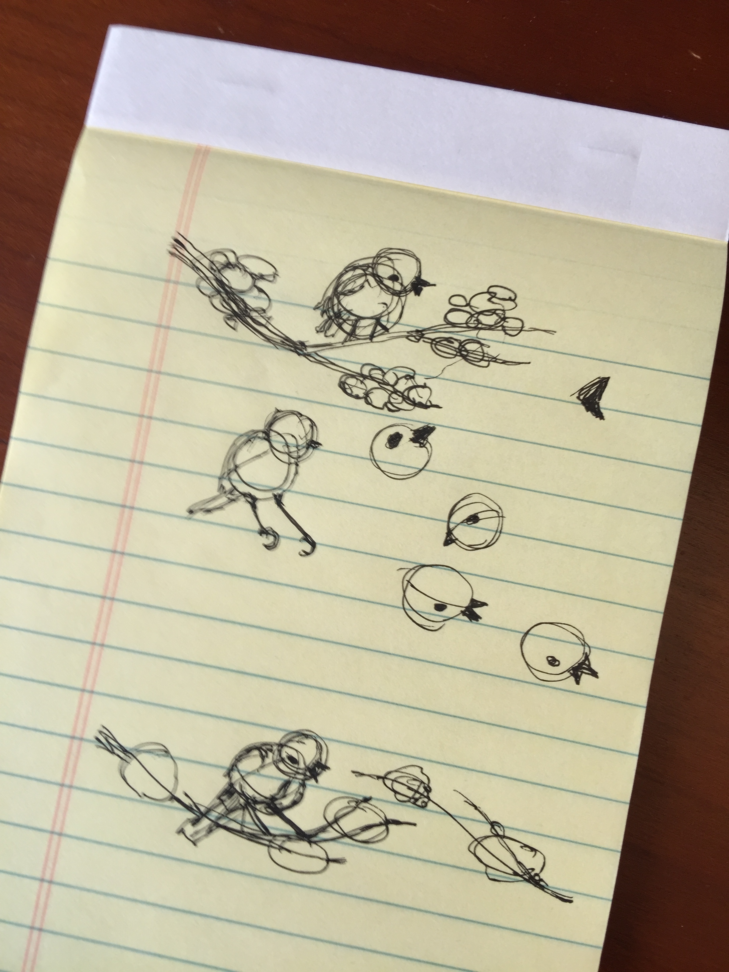
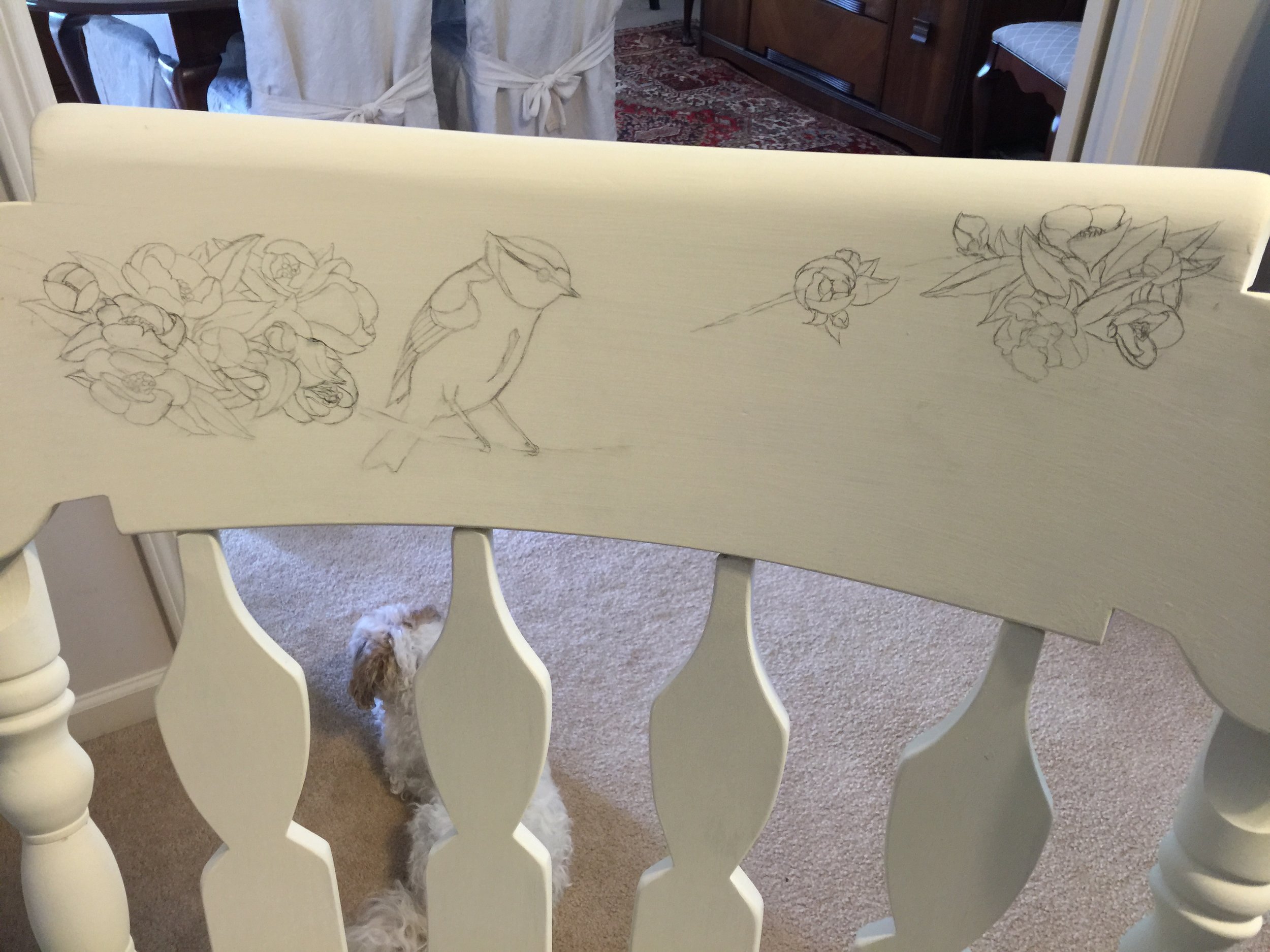
A rough sketch to determine the flow and balance of the masses. A number of other doodles preceded this version and were discarded. But, I finally found something I like (page bottom) that also will fit within the narrow target area.

Masses
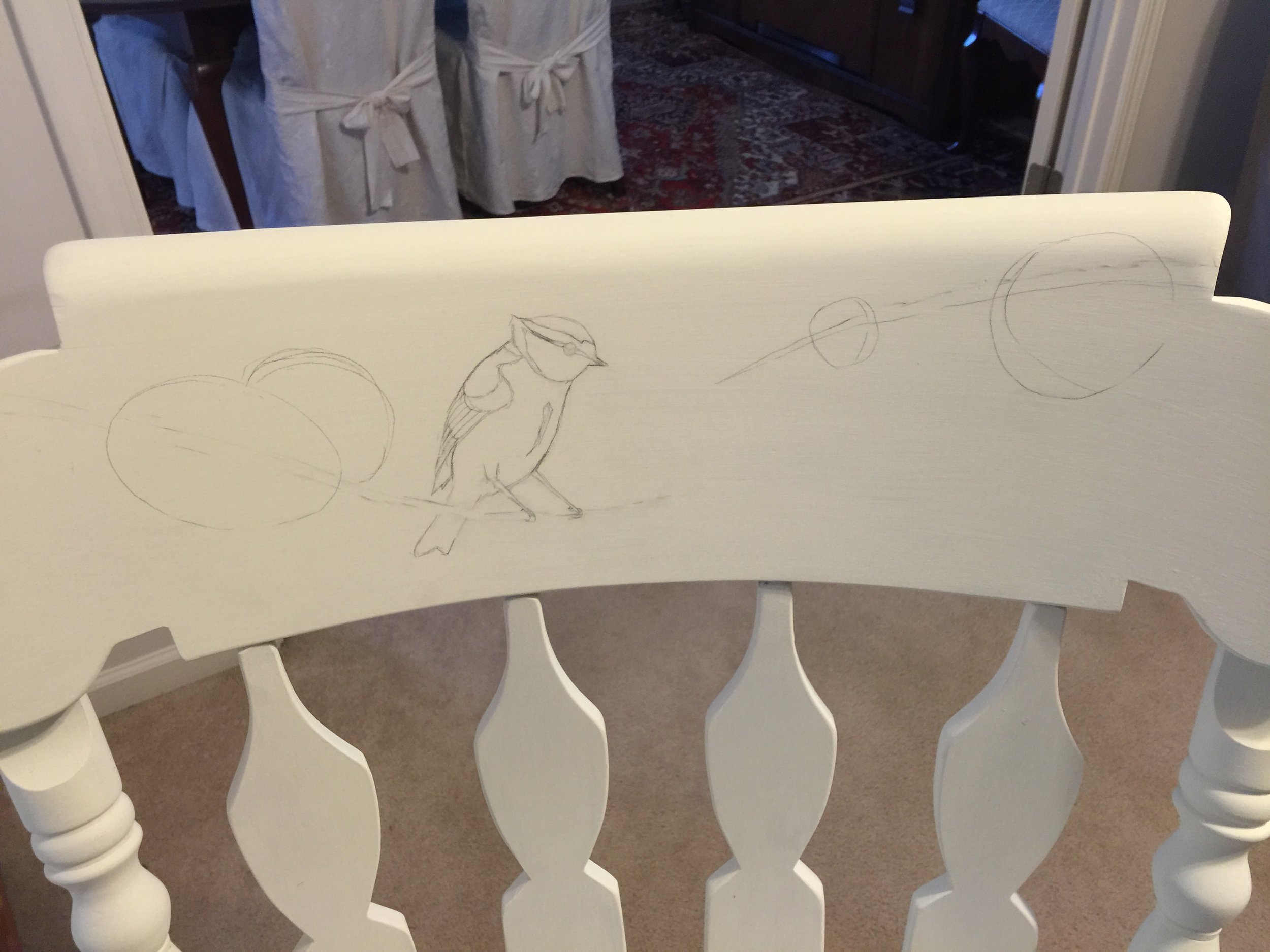
The masses are blocked in as basic shapes and then details are sketched into those zones.

Bloom by Bloom
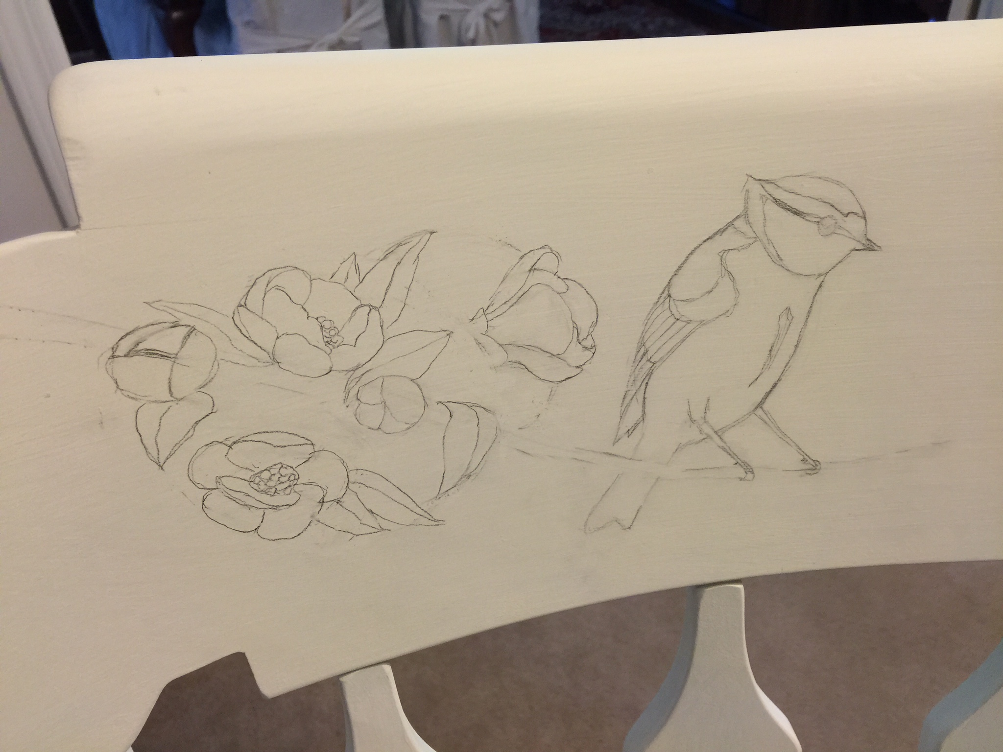
I look at many photos of quince, searching for petals and blooms shapes that intrigue me and I build each flower. I work instinctually, sensing a flow, a balance, and a compliment of the shapes that builds a unified and harmonious cluster. Although I'm only capturing outlines, I envision the shadows and highlights as I make my choices.

Left Hand Sketch
The left branch sketching is complete

Right Hand Sketch
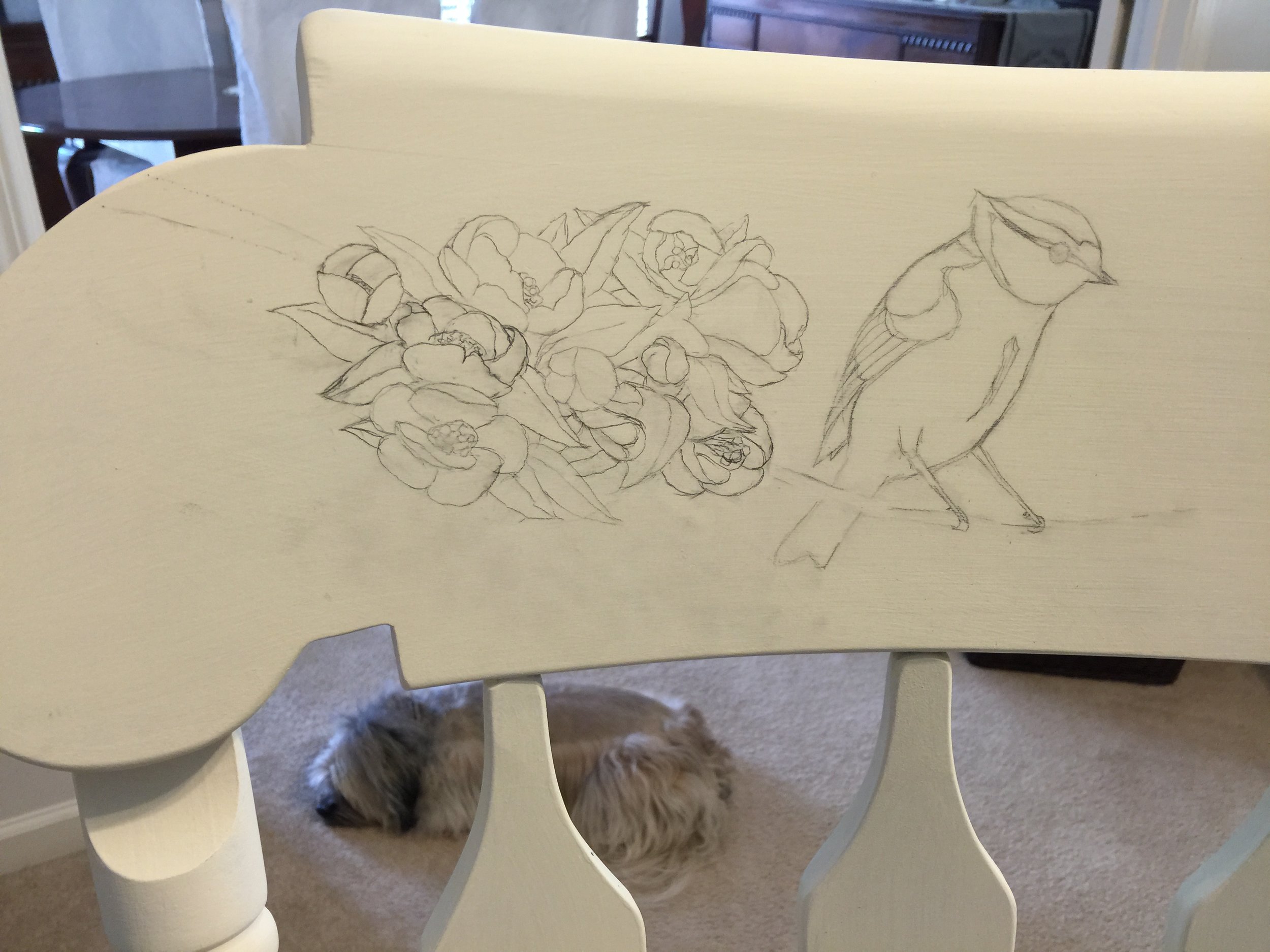
The process was repeated for the right-hand side. Now that sketch is complete, the next step was to ERASE the entire drawing! Otherwise they will smudge, dirty the colors, or show through the translucent over-painting and mar the effect. The erasure isn't total, however and faint ghost of them remains and is sufficient to guide me without interfering. Also, I referenced this very photo during the painting process when the lines were too faint or non-existent.

Palette
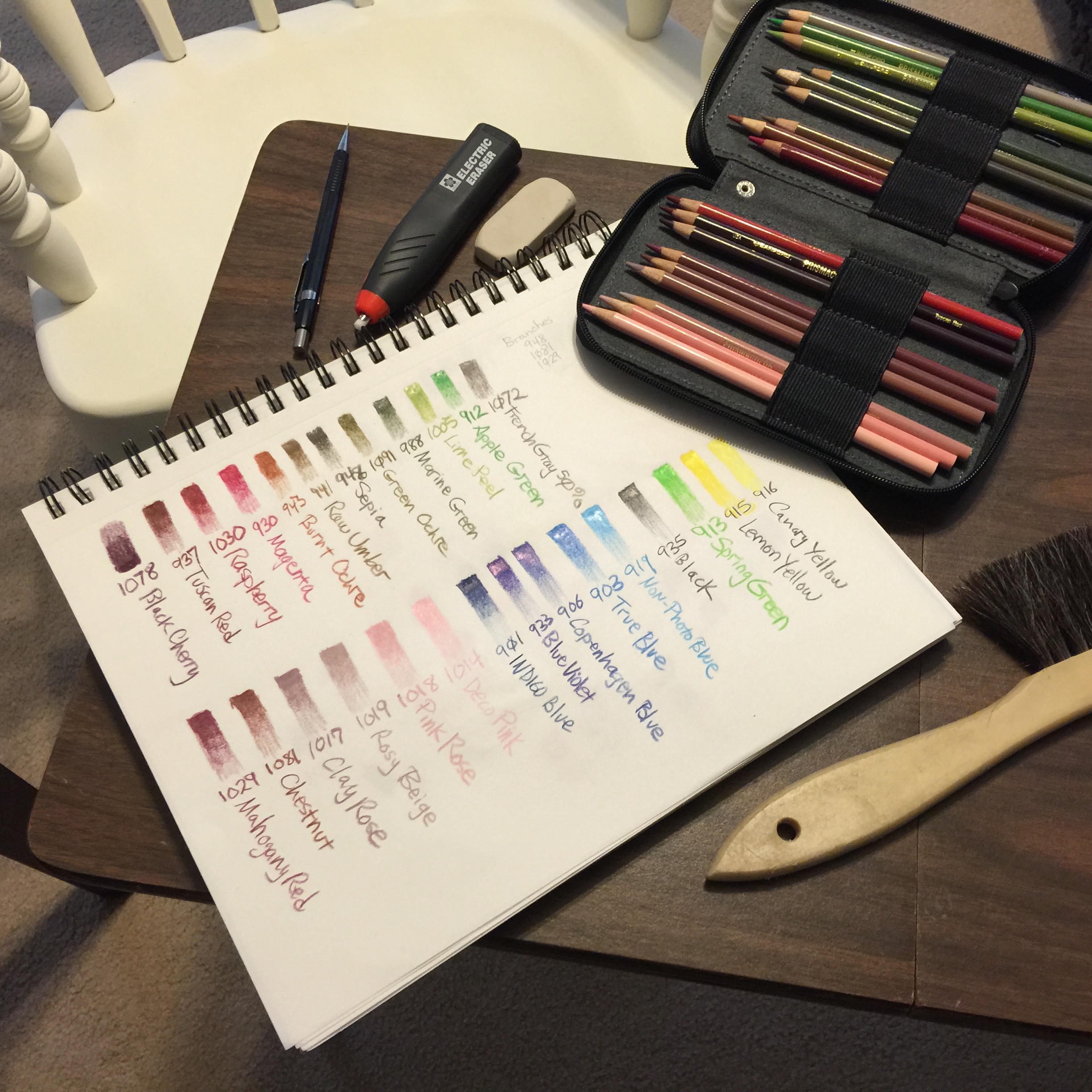
After doing a color study, I built a palette for the project. Also in the photo, going clockwise, is a Pentel P205 mechanical pencil, a Sakura electric eraser (for detail work), a Sanford Magic Rub eraser (for large areas), pencil caddy, and horse hair brush.

Blossoms
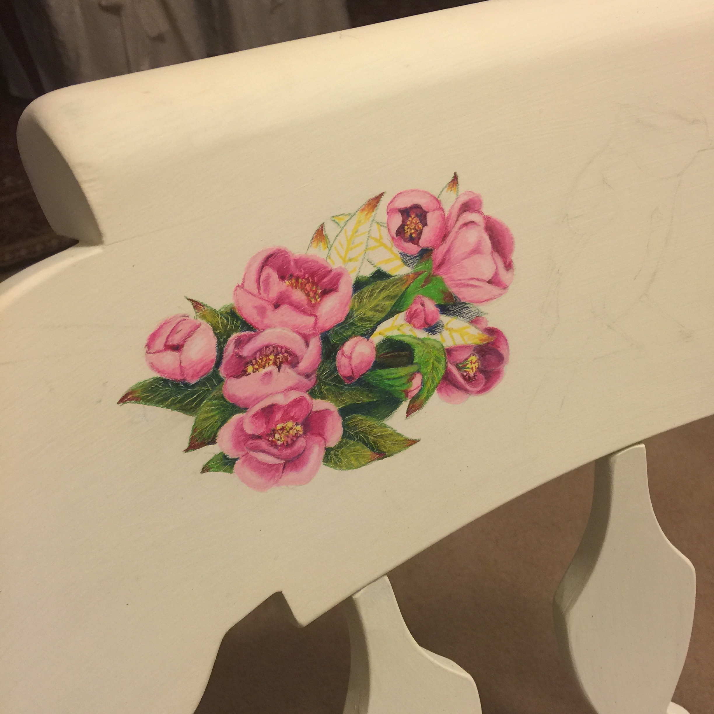
I render the blossoms first, working from light to dark. The leaves are done after all the blossoms, since I want their darker tones to "frame" the flowers and make them the main performers.
When I get to the leaves, I do an under-painting of yellow to give them a glow, and red for the leaf tips. Then I scrape the vein patterns lastly to allow the under-painting to subtly show and give them texture, depth, and realism.

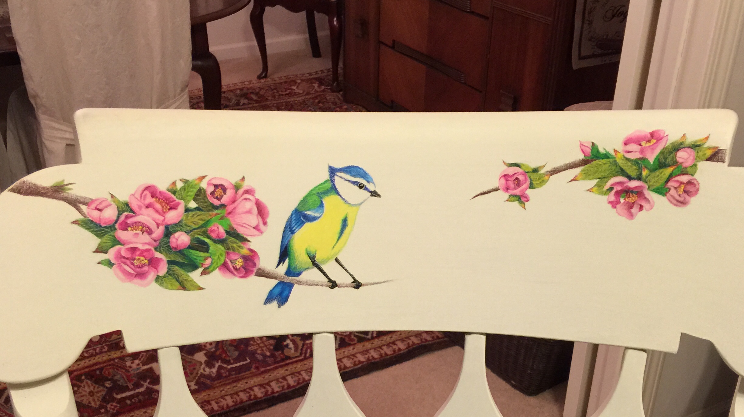
Right-hand Blossoms

Wing Closeup
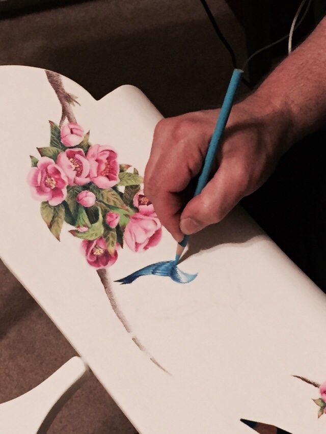
A closeup of the blue titmouse wing as I build the colors and textures.

Upside Down
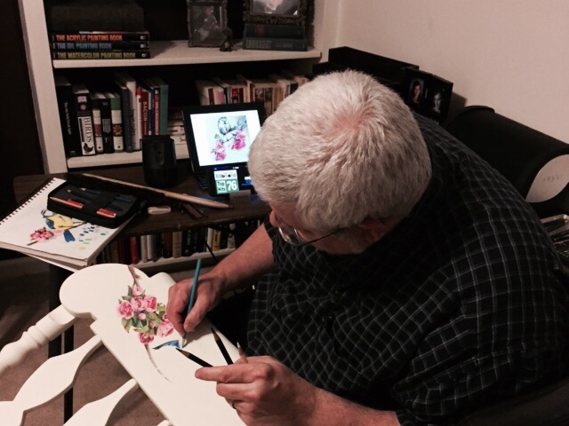
I'm working on the painting upside down in order to have firm support of the rocking chair's back.

Sealed
After finishing, I carefully clean up any stray graphite smudges before sealing the artwork with several coats of matte fixative. This will also prevent any wax bloom and protect the Prismacolor from the top protective finish of Annie Sloan clear wax. Without the fixative barrier, the application of a finishing wax would dissolve and smear the Prismacolor, destroying the piece.

Chemical Test
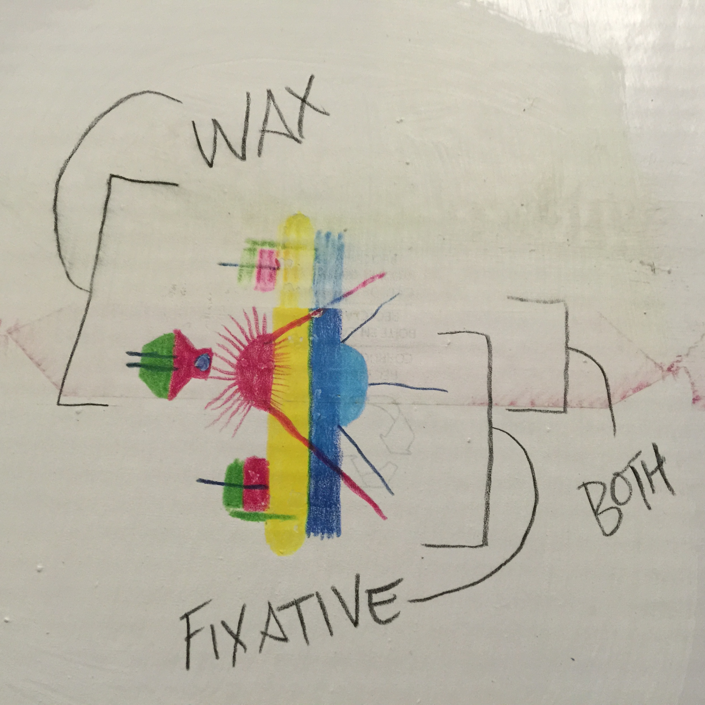
In this photo I've laid down both blocks of color and fine lines on top of Annie Sloan Pure White chalk paint. Then I coated them with the finishing wax and/or fixative to test the interaction between all the materials. You can see at the very top the colors were dissolved by the wax finish when there was no fixative, so I knew I needed an intermediate barrier. In the middle section, I can see the two finishes play nicely with each other and did not create a weird chemical reaction and burst into flame. Lastly, since any coating will shift the colors, I wanted to ensure that shift was minimal, especially since there would be multiple layers.

Finished
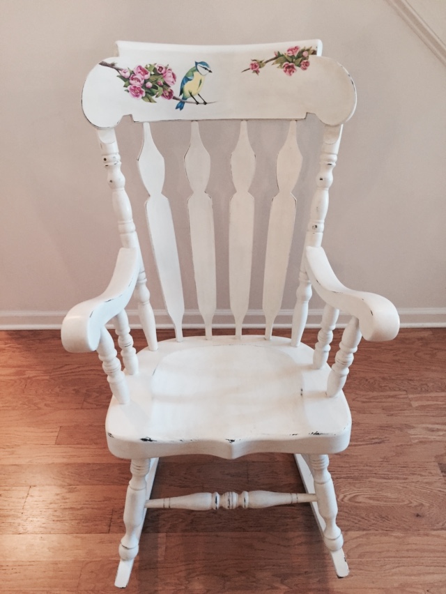
The completed rocking chair after the final protective wax finish and some tasteful distressing to give it an antique feel.
